Xero
UX/UI Design
Visual Design
Information Architecture
The problem
Over the last 3 years the website has gone through a large content migration, switching from one tech stack to another. Part of this work was executing a strategy called 'dotcom reimagined', which allowed the site to take a template focussed approach to support fast and accurate migration. With the migration and 'dotcom reimagined' work nearing completion, an opportunity arose to take a look at Xero’s front door.
Project Overview
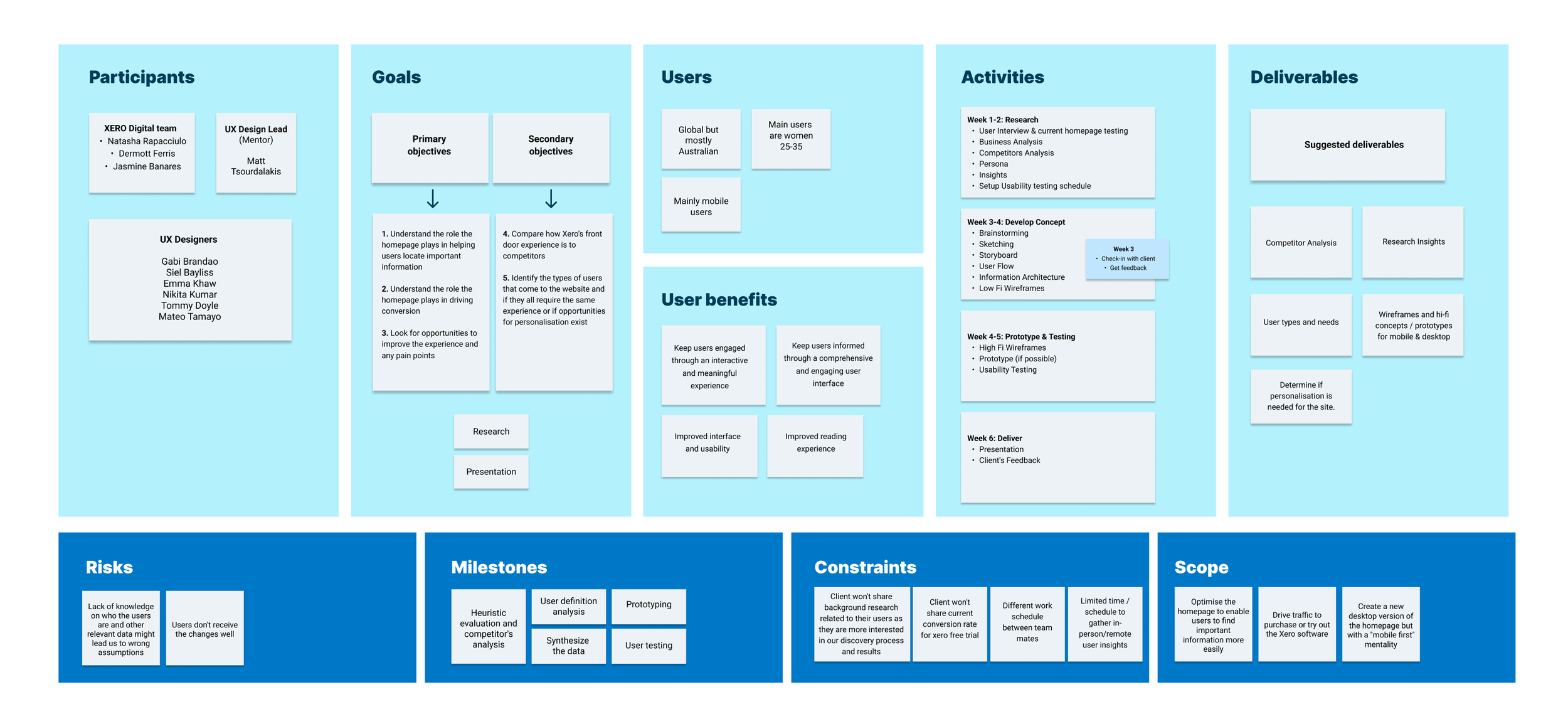
The objective of the project was to identify opportunities and pain points in order to improve the homepage user experience, and implement a mobile first design approach.
Constraints: We had no access to Xero's customer database, any background research, conversion rates data, and usability testing results on their current homepage.
To avoid working on assumptions we conducted our own research and based our design solutions in our findings.
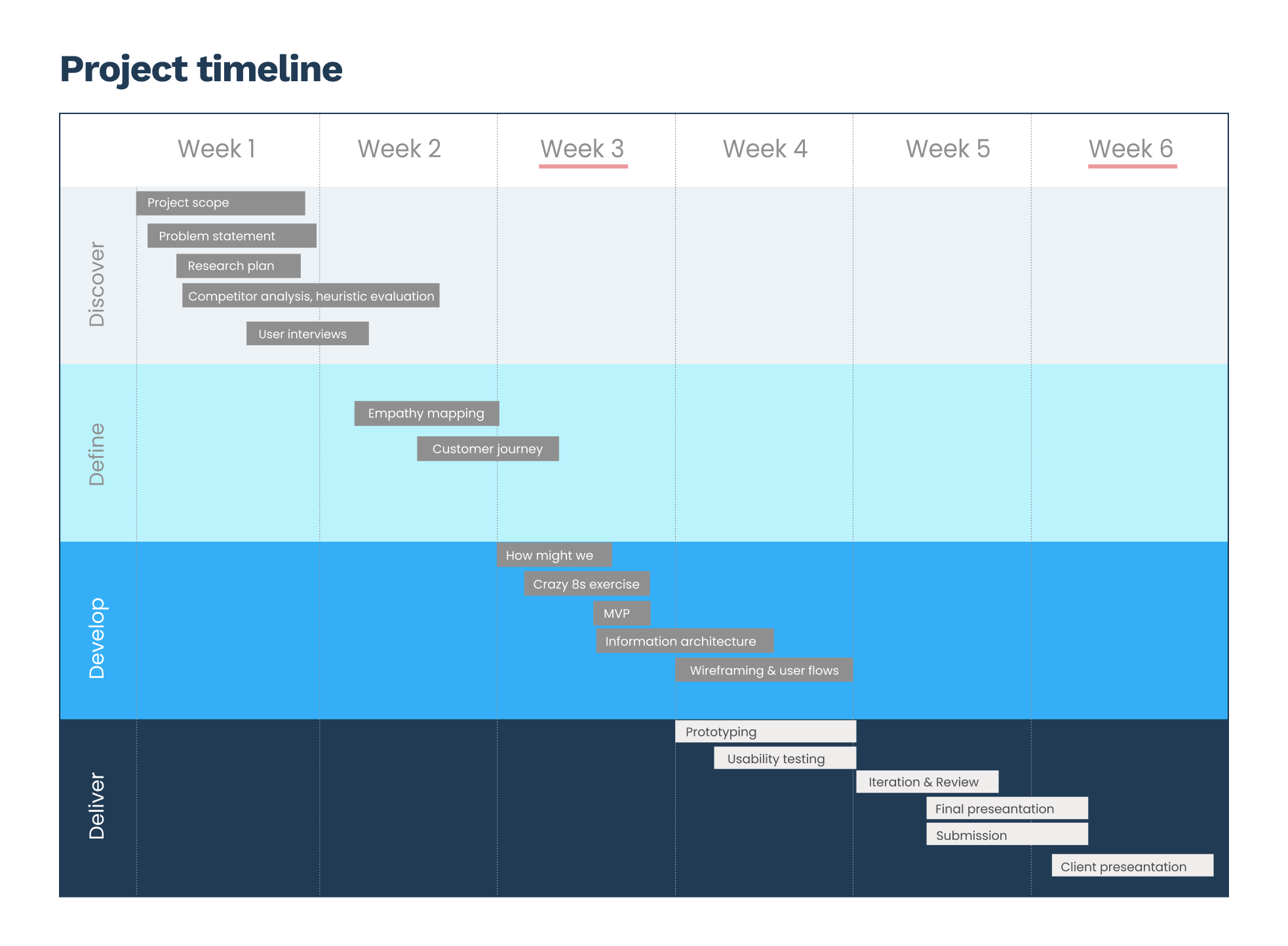
The discovery and definition journey
In the discovery phase of the project we were seeking to explore and understand the problems in order to reframe them from a human-centred perspective.
We divided our research in three phases. In the first phase we gathered as much data as we could to understand more about the marketplace. We also performed competitor analysis to identify how they were communicating with their audiences, and conducted heuristic usability evaluation.
In the second phase we conducted vetting surveys to recruit users for 1:1 interviews. During the interviews we performed lean user testing on Xero's current homepage to understand users' main pain points.
The third phase took place during the development and delivery stage, during which we tested our high fidelity prototypes.
Phase 1 - Competitor analysis and heuristic evaluation
• Foundational research
• Competitor analysis
• Heuristic evaluation taking into account Nielsen's 10 usability heuristics rules
Phase 2 - Surveys & interviews
• Screening survey to identify candidates that are representative of the target audience
• Survey with actual Xero customers to gain end user insights
• 1:1 Interviews and testing on the existing homepage with the two cohorts
Phase 3 - Usability testing
• User testing - high fidelity prototypes with 4 Xero customers recruited from Askable.
• Demographic:
- Age: 22-45
- Users: 4 participants (2 small business owners and 2 accountants/bookkeepers)
- Device tested on: mobile and desktop
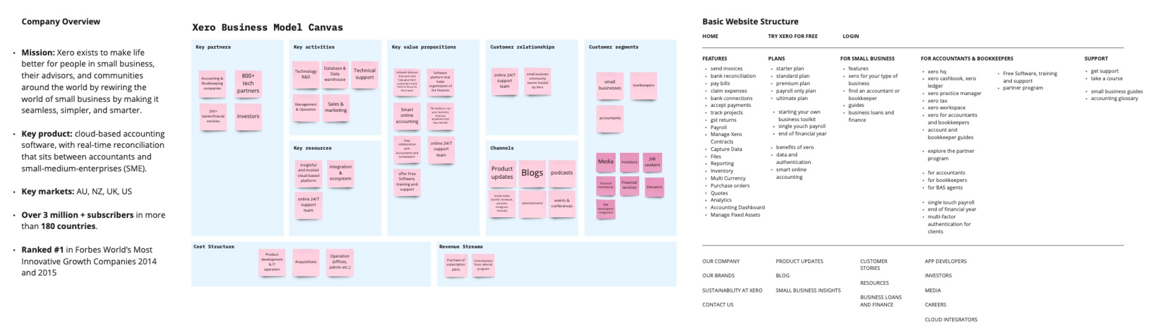
Project Canvas
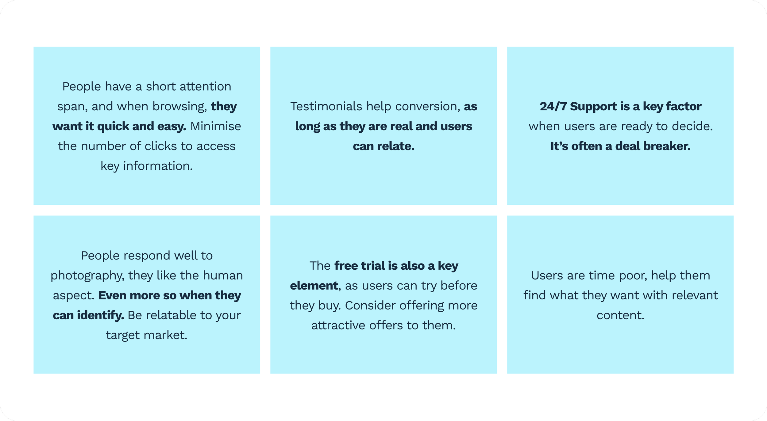
Foundational research findings
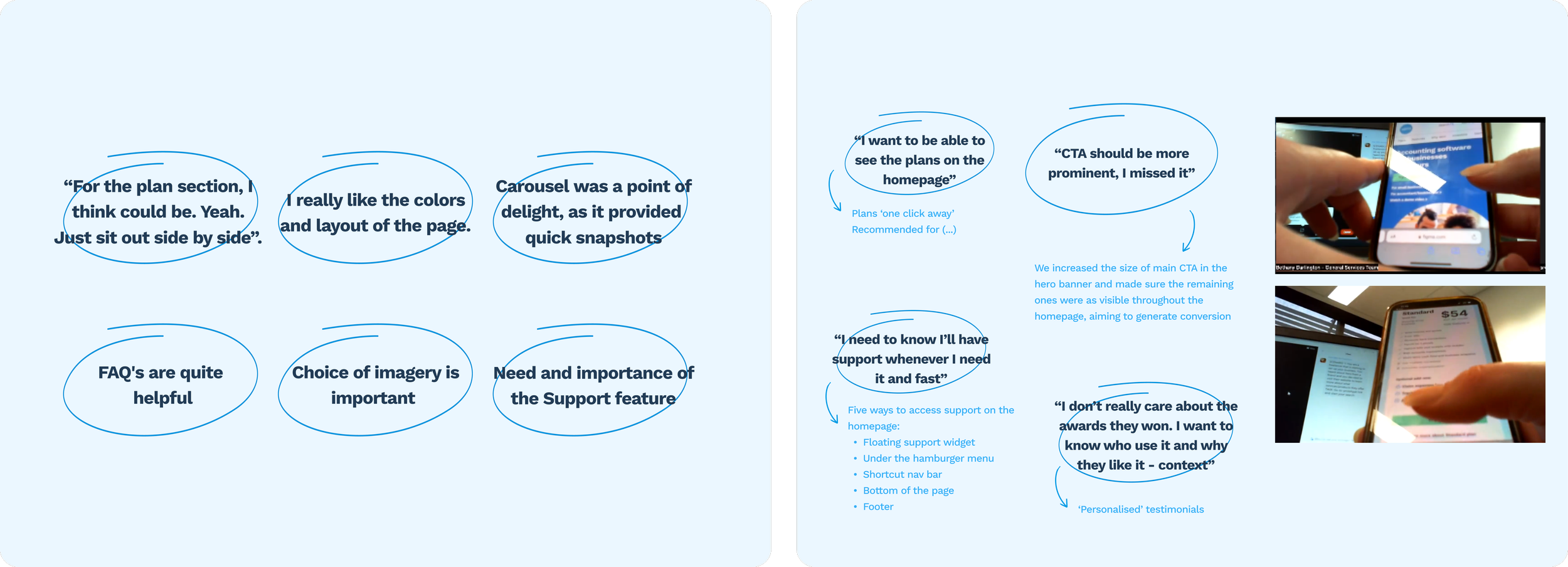
First round of user testing insights and interviews' main insights
The development journey
After completing the first two phases of our research, we were able to build empathy maps and customer journeys for each user. This helped us to understand their pain points and identify possible opportunities to improve experience.
The synthesis of the research and user testing revealed a number of insights, pain points and opportunities to improve satisfaction and create delight. That led us to the ideation process where we constructed new problem statements (HMWs) that allowed us to diverge the design thinking before the upcoming development phase.
The HMWs, a Crazy 8s exercise helped us identify possible design solutions to address the problems.
After choosing the winning ideas, an MVP matrix was used to help us identify the version of the product that allowed us to collect the maximum amount of validated learnings with the least effort.
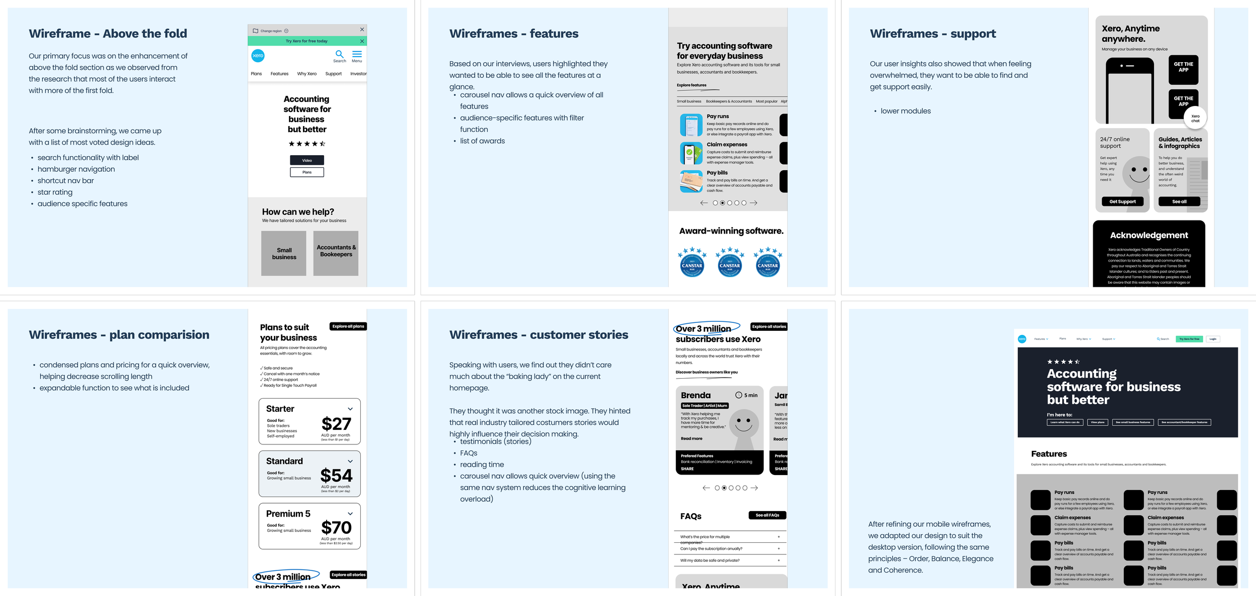
Then, we designed wireframes and user flows to illustrate our solutions, and tested them internally before moving on to the high fidelity prototype.
The delivery journey
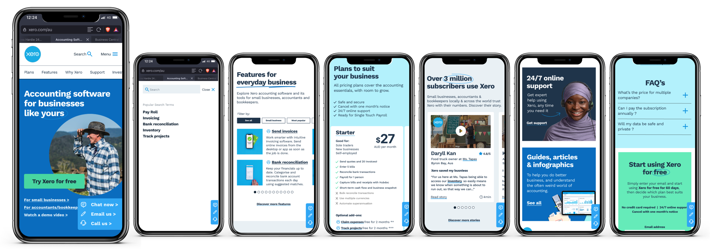
In the prototype we focused on improving discoverability and findability of the features and content. Some of the key pain points addressed were:
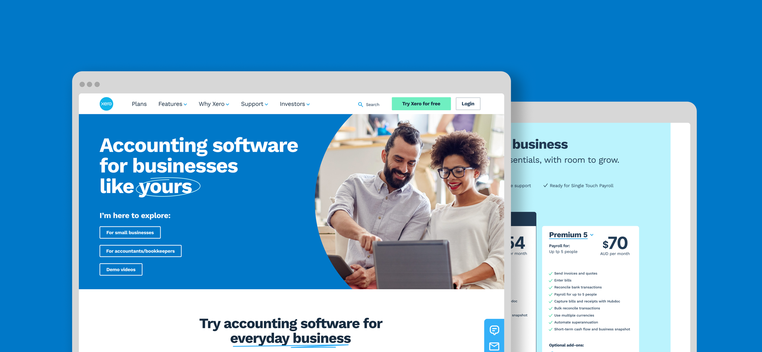
Search bar: Xero has a lot of information on its website so a search bar was included in the header to make easier for users to find the information they were looking for. Reducing the number of clicks to find support was also a key optimisation.
Homepage banner: The height of the banner was reduced so more content was visible above the fold. We also focused on using photography of real people using the product to create relatability for users.
Features: Below the banner, a carousel with a filter function allowed users to filter Xero's features by industry or browse them all at their convenience. We also added a description and a snapshot of each feature to encourage decision making.
Payment plans: The plans were added upfront so users could compare and analyse the options without having to leave the homepage.
Testimonials: We upgraded the testimonials section with more relevant information for users.
Support: This was a big pain point identified during our research and testing sessions. Users want to know they will have the help they need when looking for information and assistance. We included a floating fixed 'support bubble' that on-click would give users the choice to call, email or chat with Xero's representatives.
CTA's: The CTA's were re-labeled with clearer and more actionable titles.
Footer: The footer was simplified and its sections grouped accordingly in a drop down list.
Recommendation and next steps
Insightful positive feedback was received from users leading us to conduct minor design iterations. Recommendations:
Considering extending the trial period
People might need extra support to help them onboard. Consider offering help through Xero mentors or recommending verified accountants around them to help them.
Consider having testimonials from well-known companies to increase trust and conversion.
Avoid stock images, people have a good sense they are fake.