Project Overview
"Crisis News Network" or CNN is the largest syndicate of breaking news and other news worldwide. Their focus is on the millennial audience and they need the news experience on their website to be re-thinked.
The challenge was to design a compelling news site for today’s generation of news' consumers.
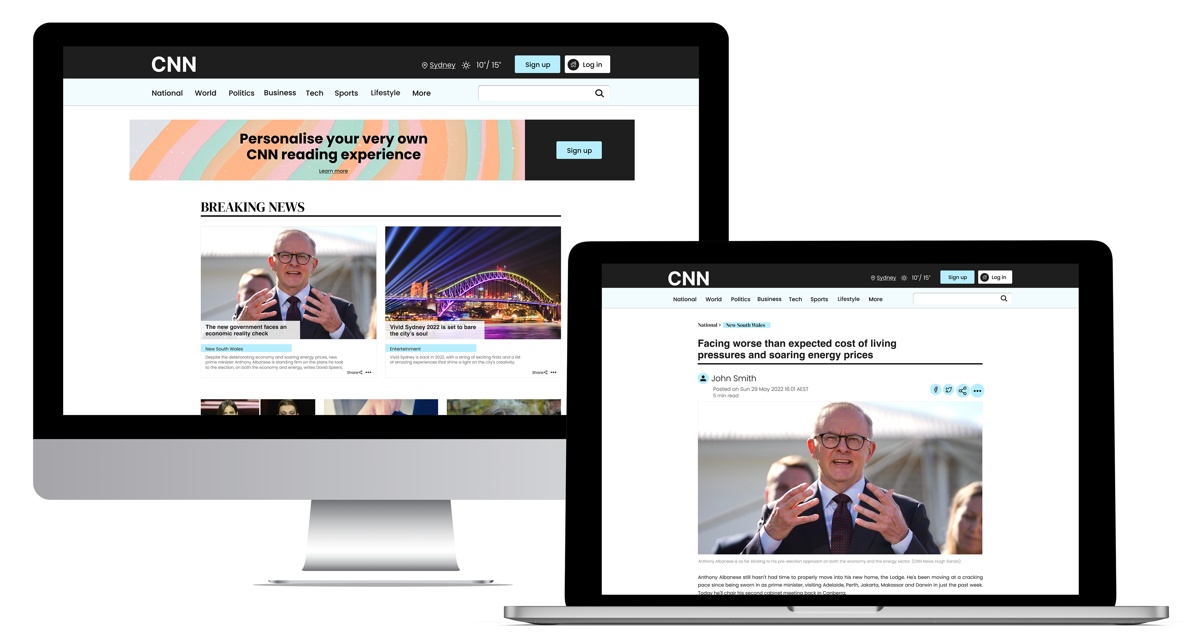
Brief: Design the CNN Platform Homepage and story page.
Desktop.
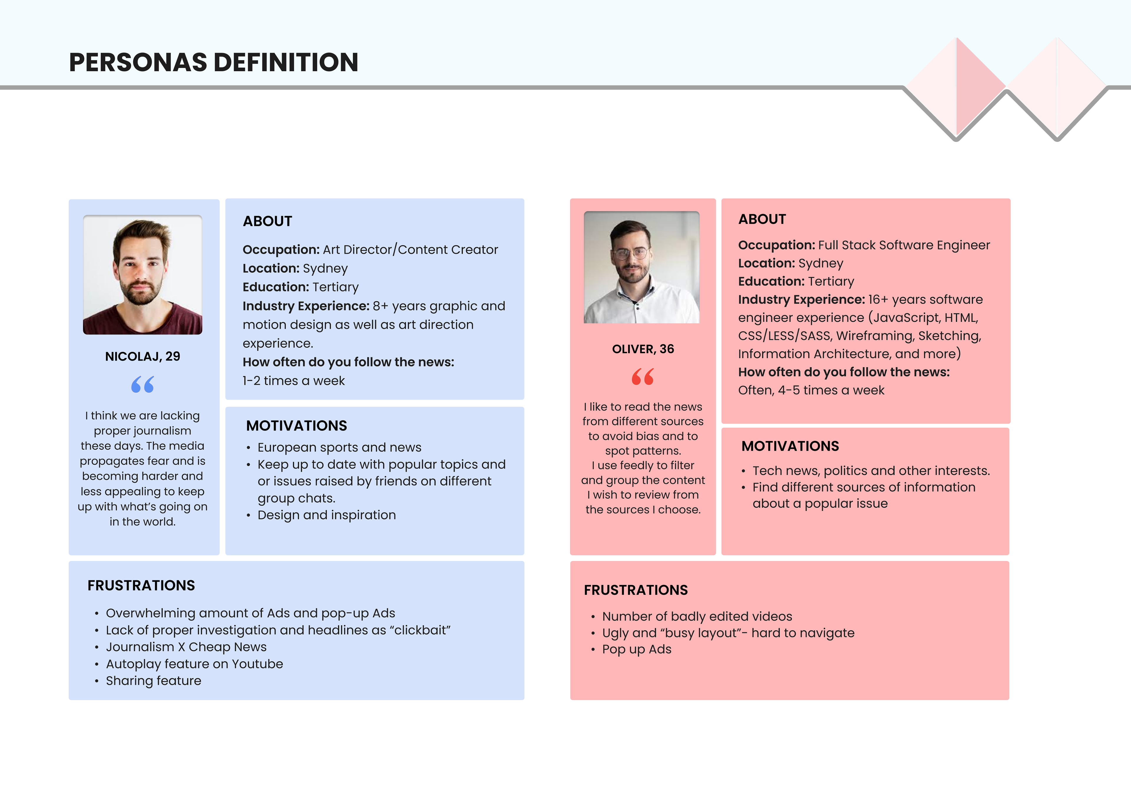
Audience: Millennial consumers 24-39 years old.
Problem Statement : Millennial consumers who like to follow the news don’t feel compelled to use CNN as they expect to have an engaging and relevant experience when consuming news and CNN doesn’t provide them with one.
Motivation: To create a more engaging and relevant experience to consumers.
Research
The research phase was divided in three phases:
1. Competitors analysis:
• Understand what other news’ platforms have to offer
• Review customers' feedback (positive and negative) - what has been working and what hasn’t.
• Learn/discover latest trends.
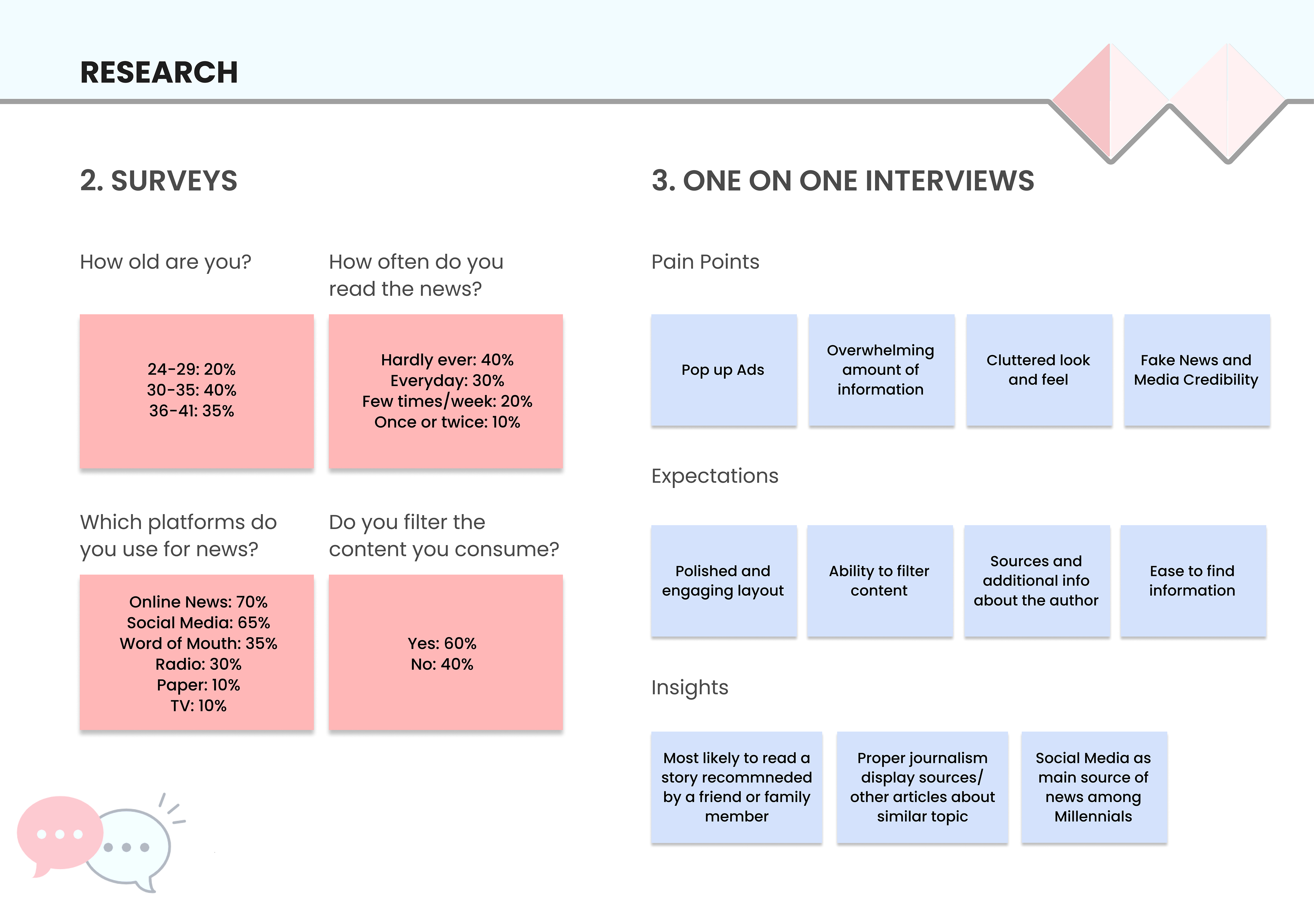
2. Surveys
• Quantitative research - broader understanding of the demographic’s preferences/habits.
• Understand how millennial access information.
• Find out what is their main source of information
3. One on one interviews
• Further understand user motivations and expectations
Research insights
The development journey
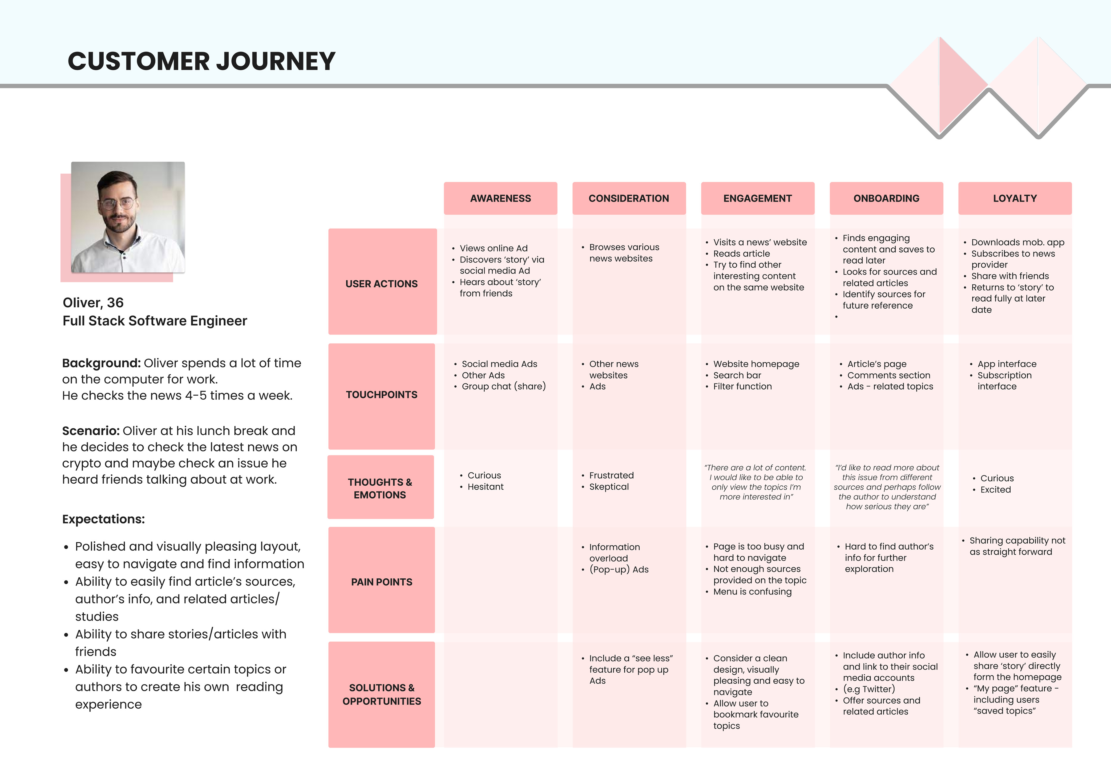
The insights I gathered from the surveys and user testing sessions helped me to identify the persona profile and build a user journey map where the main user pain points and opportunities were highlighted.

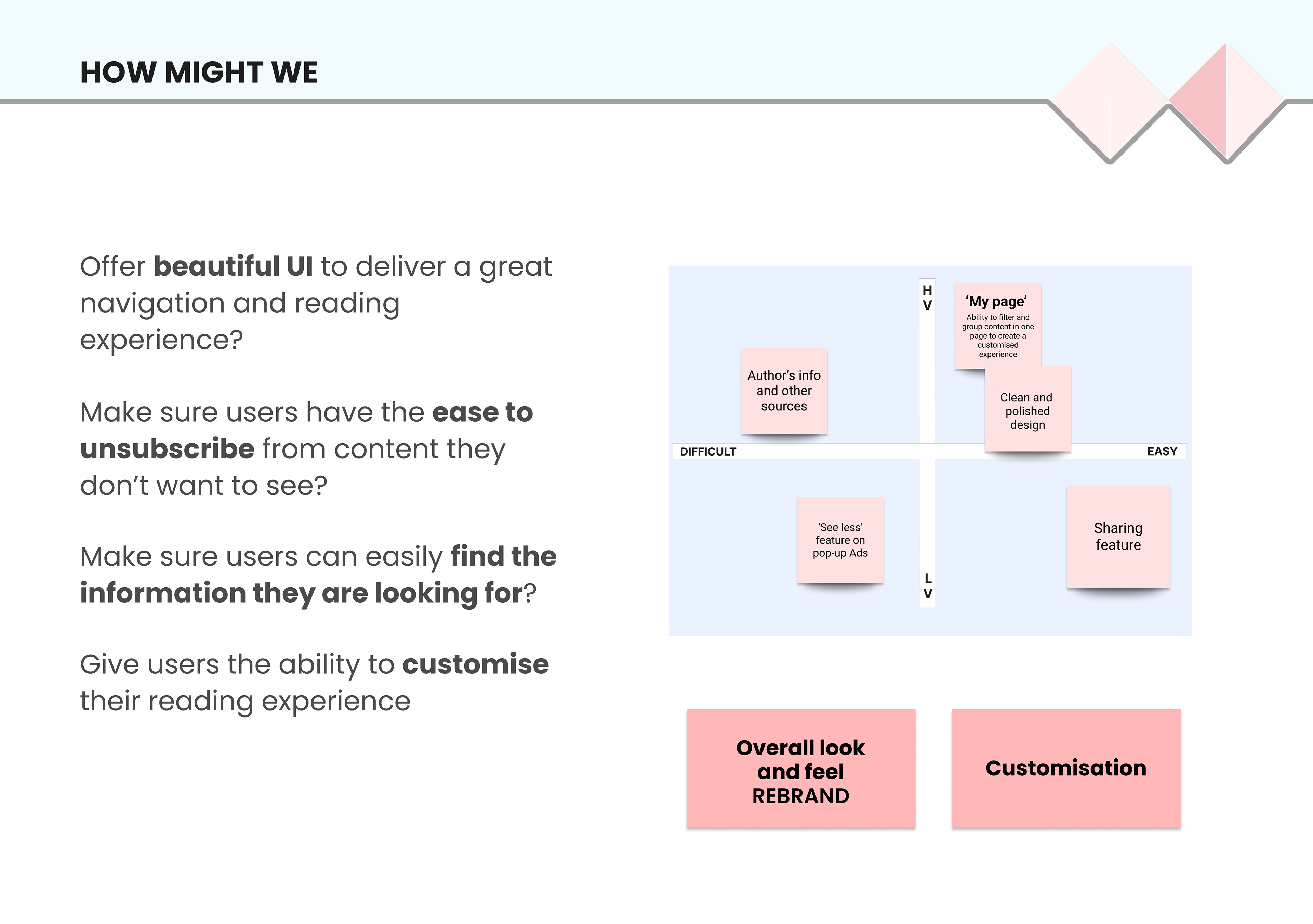
During the ideation process I constructed new problem statements (HMWs) that allowed me to diverge the design thinking before the upcoming development phase.
After the HMWs, a Crazy 8s exercise helped me identify possible design solutions to address the pain point I identified.
After the HMWs, a Crazy 8s exercise helped me identify possible design solutions to address the pain point I identified.
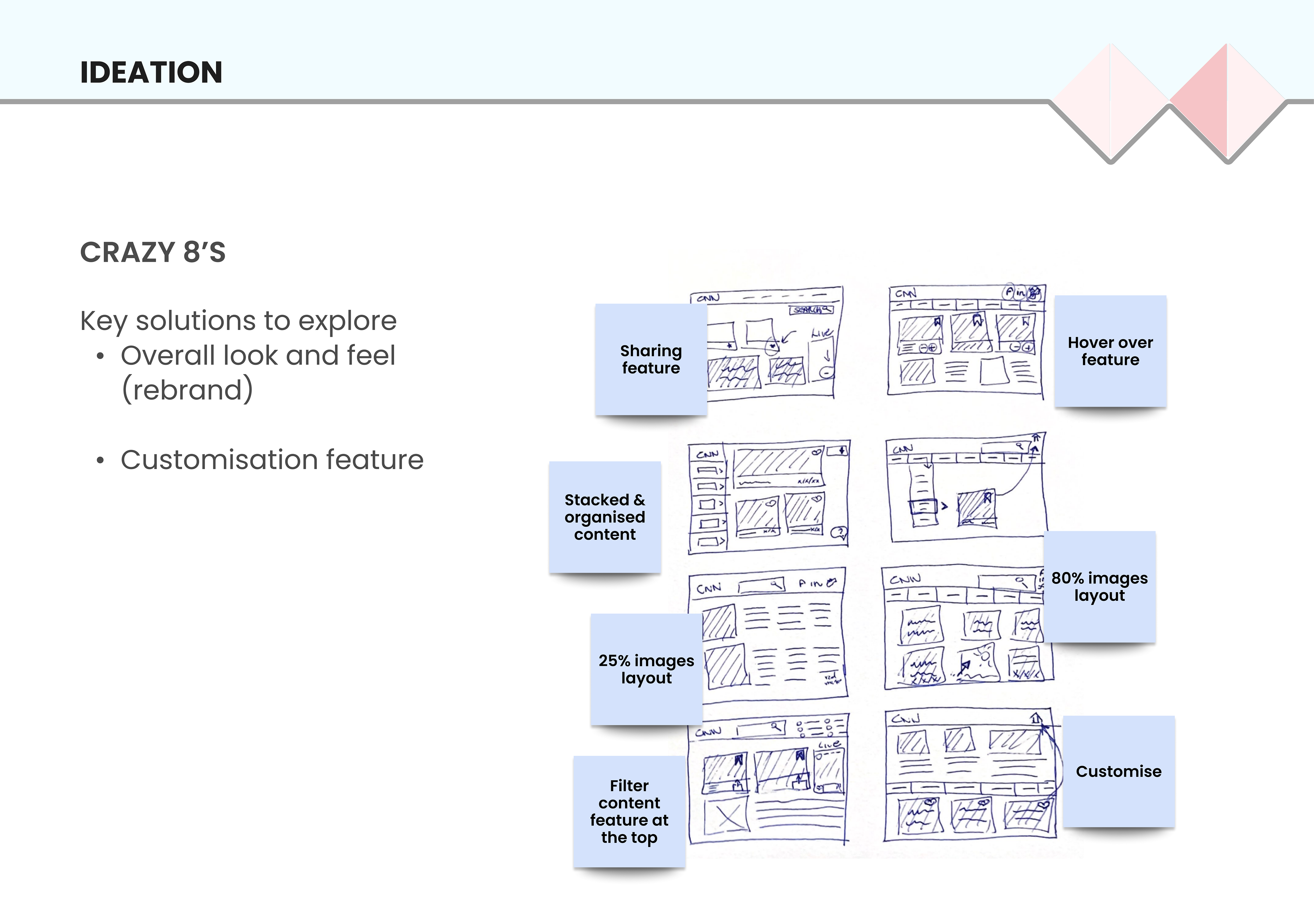
After choosing the winning ideas, an MVP matrix was used to help me prioritise the solutions that allowed me to collect the maximum amount of validated learnings with the least effort.
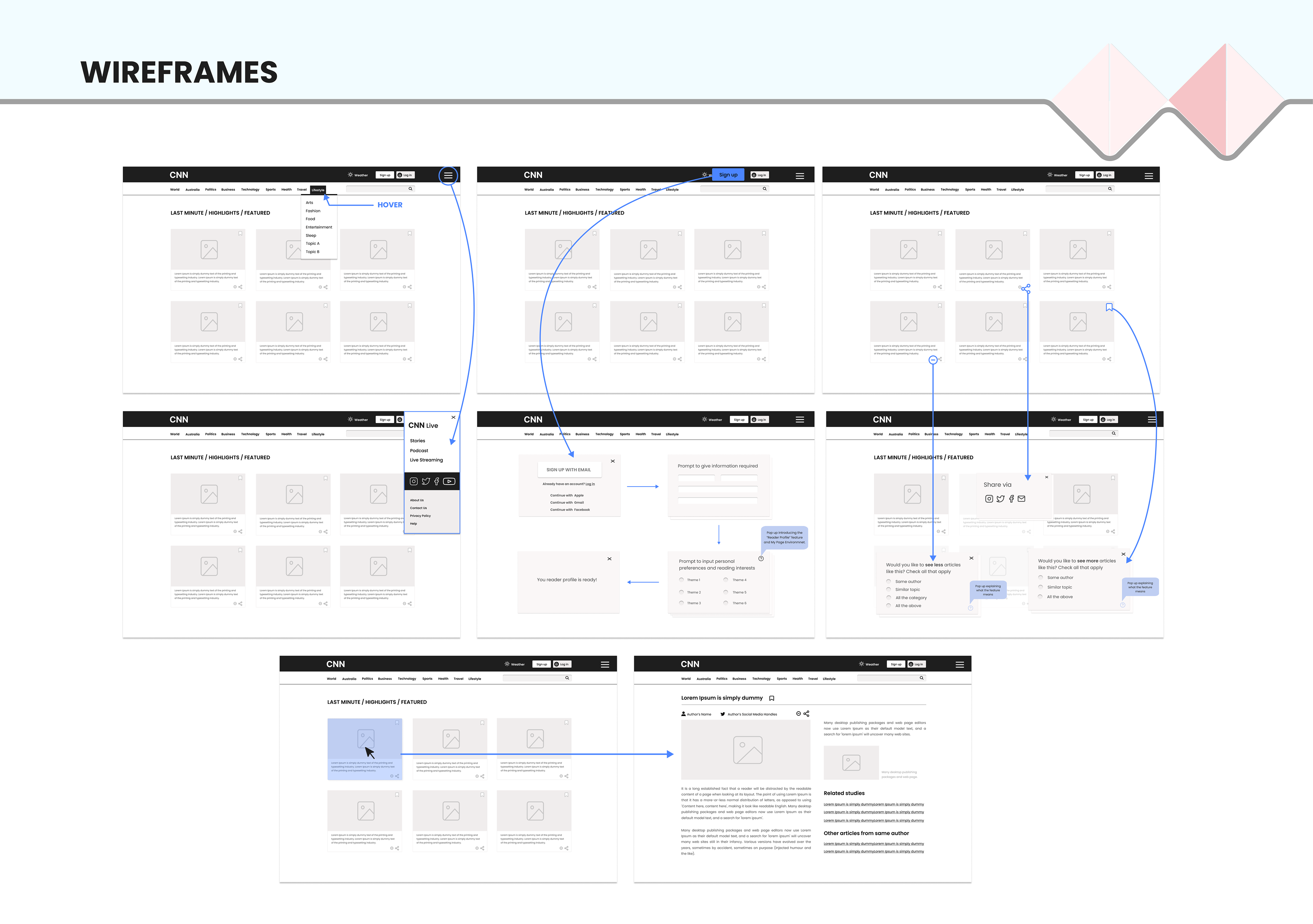
Then, I designed wireframes to illustrate the solutions, and how my high fidelity prototype would look like.
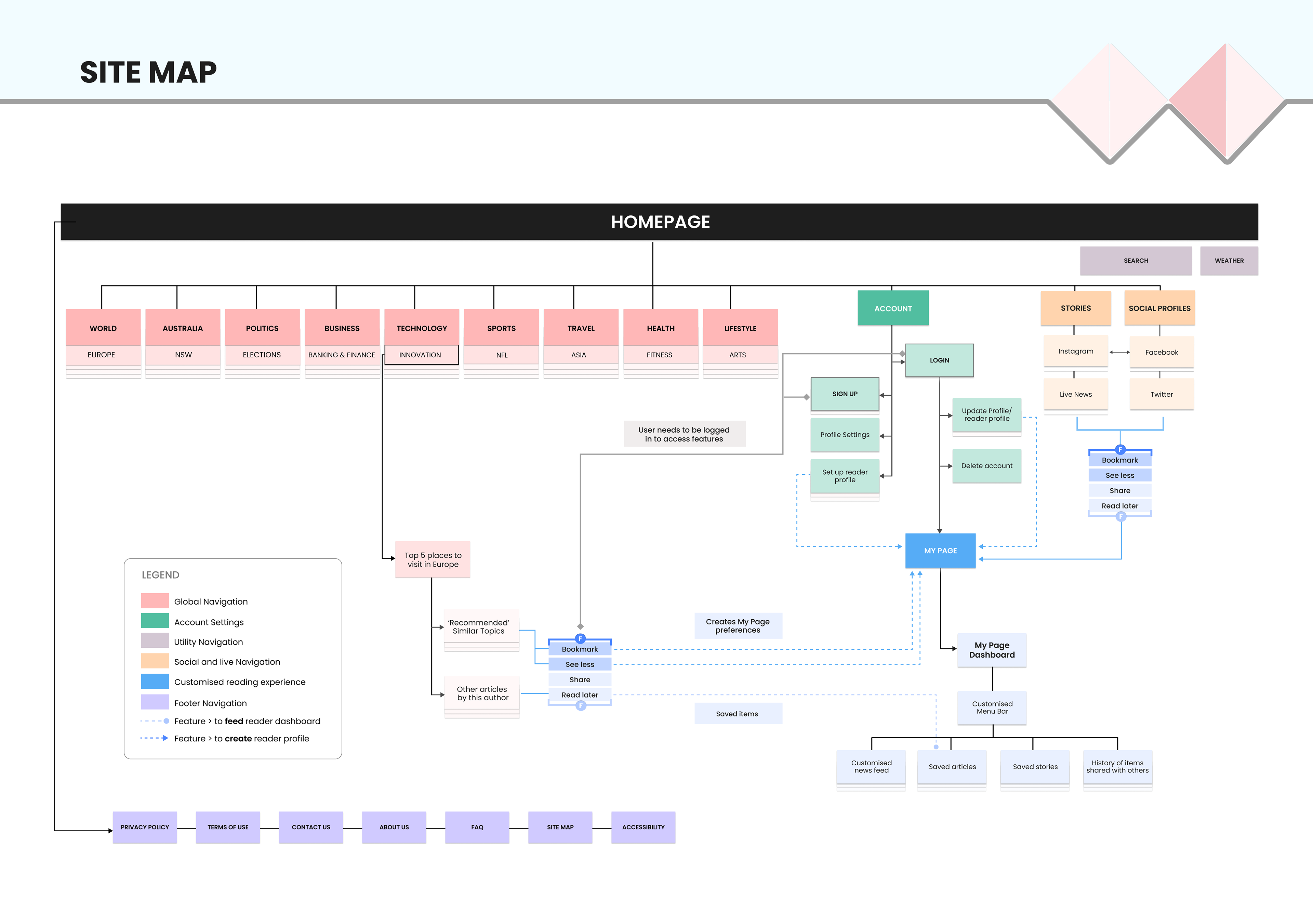
Card sorting and main navigation
After the research rounds a card sorting exercise was conducted with 6 users to understand how they interacted with the navigation menu. The feedback helped me define how categories should be grouped.
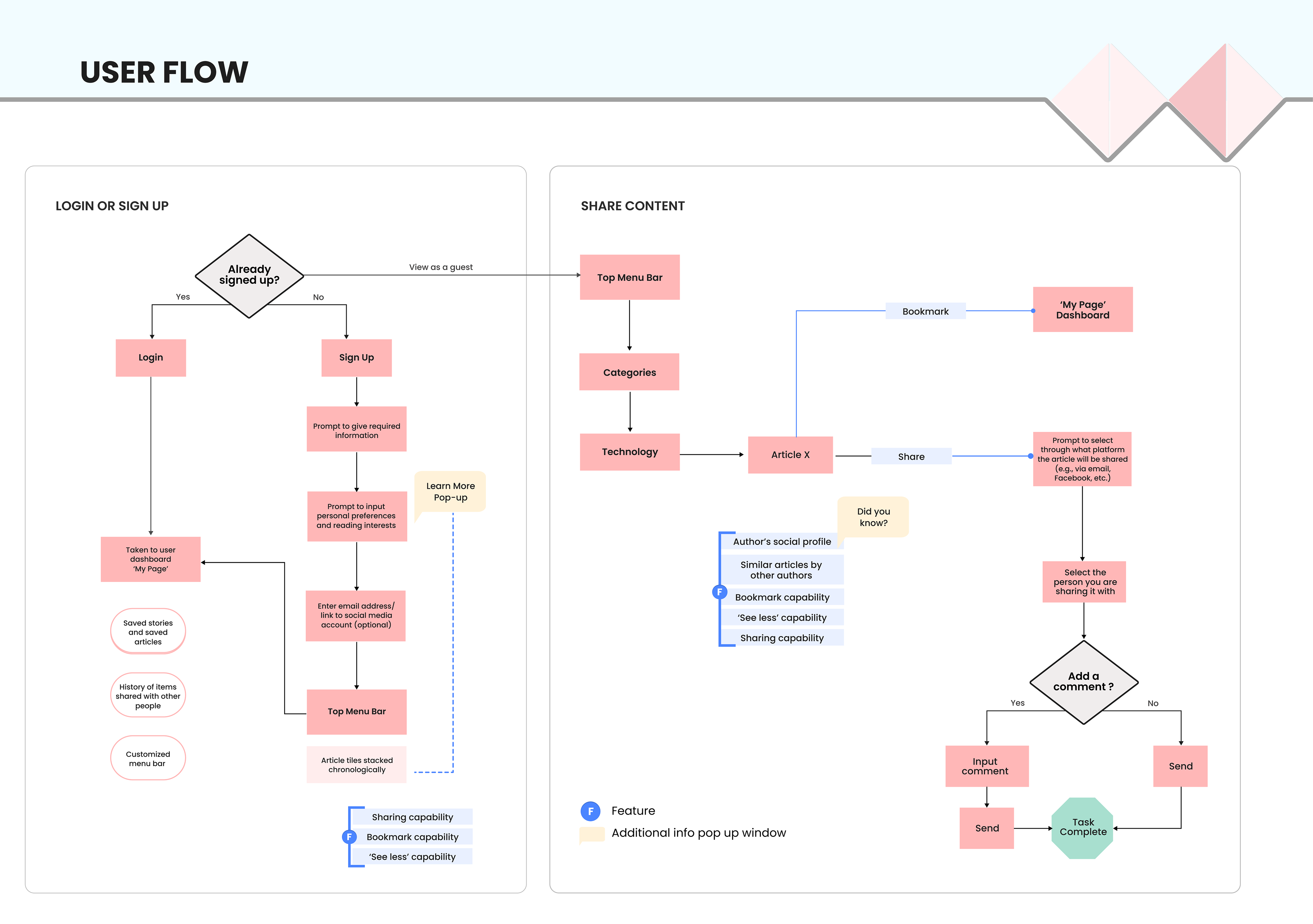
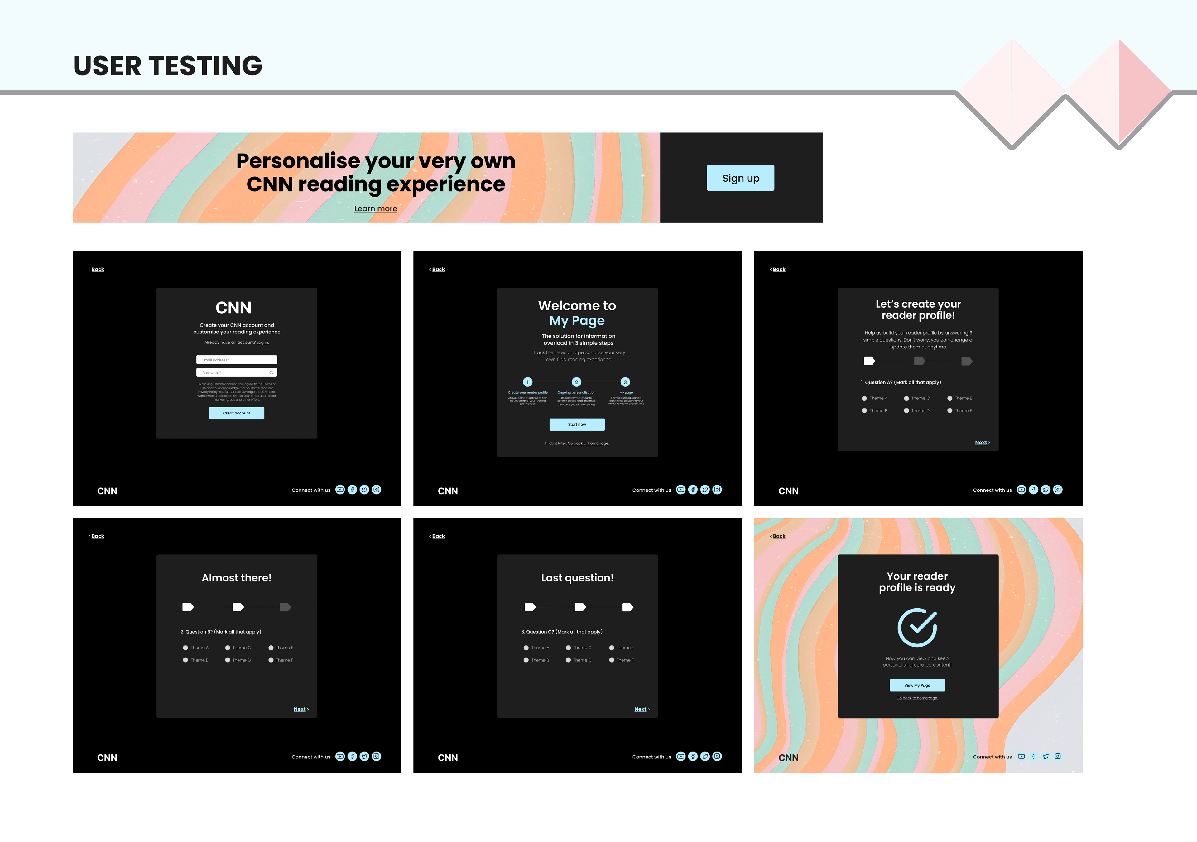
Customisation
One of the focus of my design was the customisation, illustrated below.
Basically, user would have the ability to filter content and create a personalised dashboard. The ability to curate content was designed to make the 'news reading' experience more enjoyable and less stressful for user.
The feature allows user to not only save content to read later but also to filter topics that user no longer wishes to see.
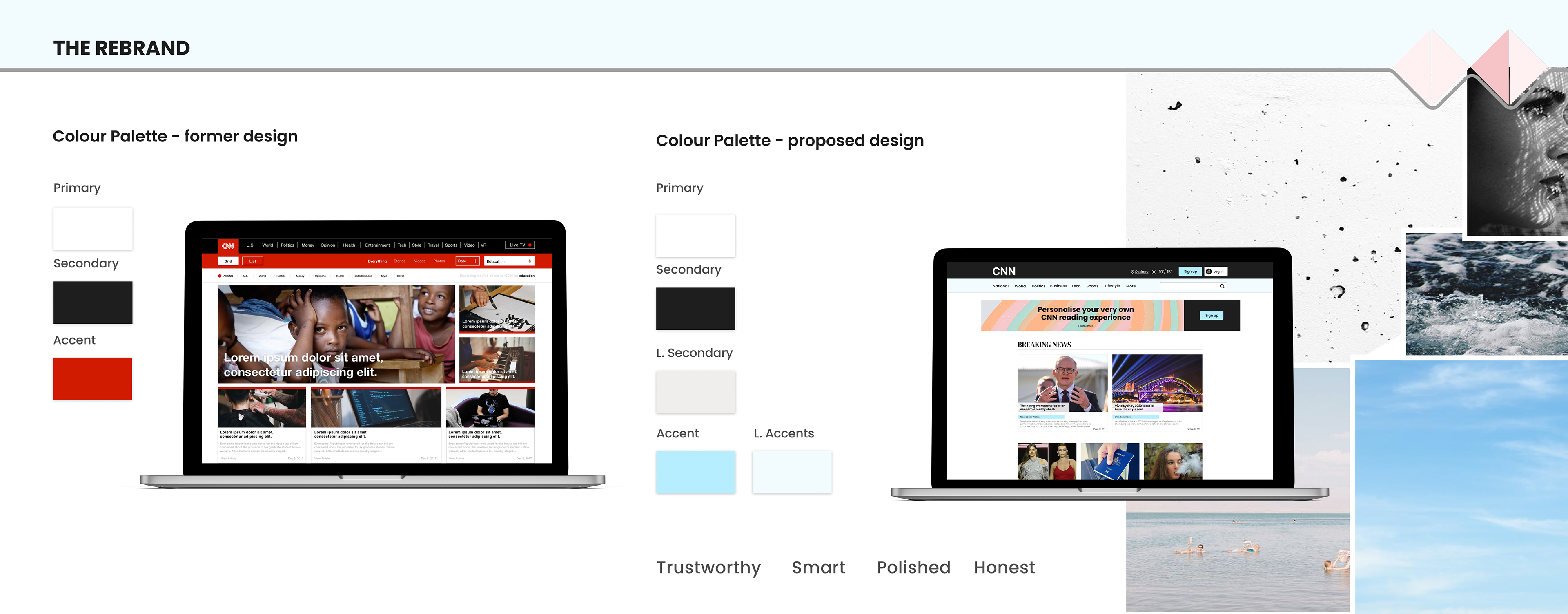
The rebrand
One of the things highlighted on my research was the bad reputation the media has among millennials. Most of them do not believe they can trust what they read.
Red is a very strong colour that resonates with anger, fear, passion, and warning which are very strong emotions. The new colour palette aims to convey the opposite.
• New colour palette envisioned to provide a 'more trustworthy' look and feel to the website.
• Less cluttered look to offer a more pleasant reading experience
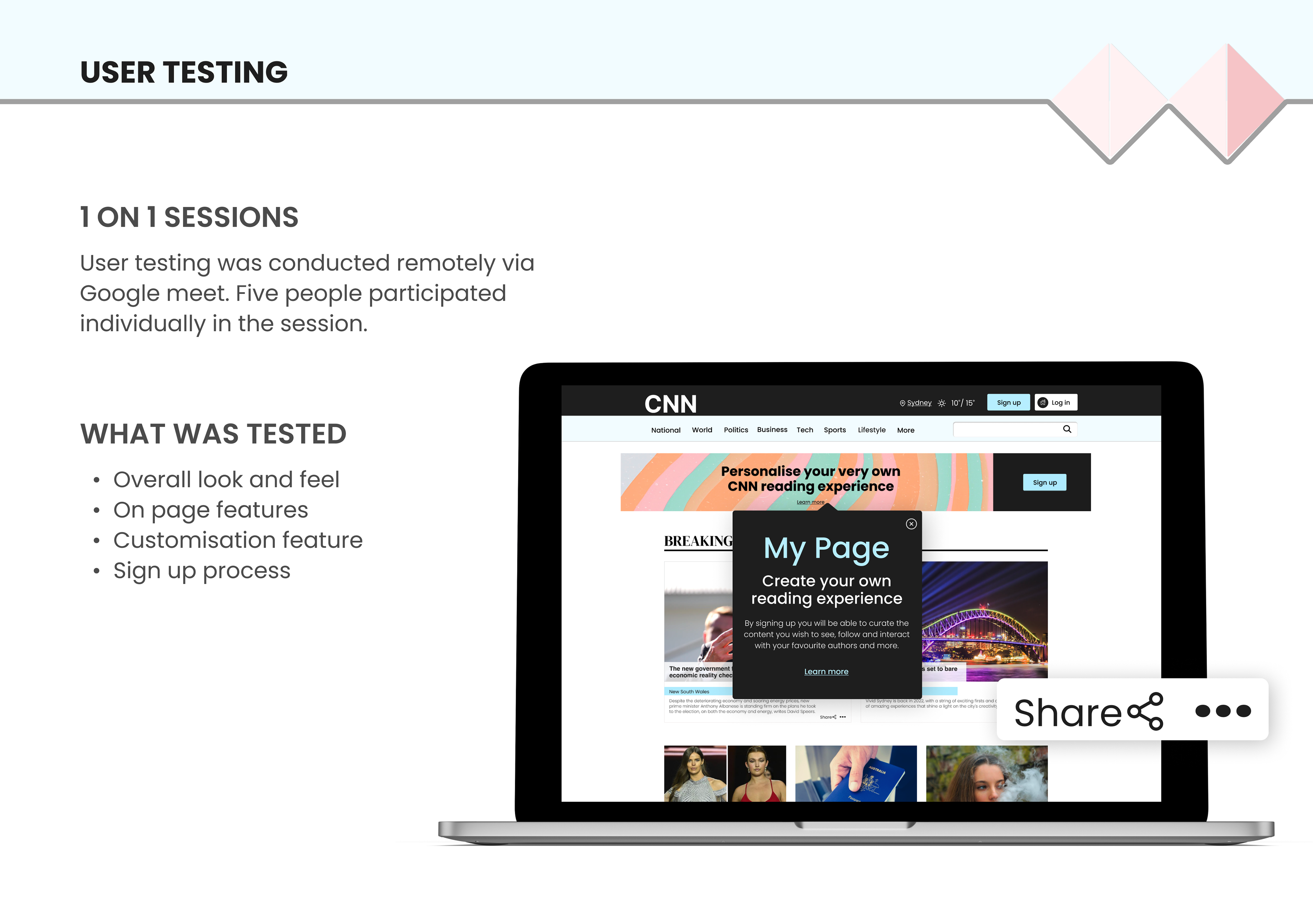
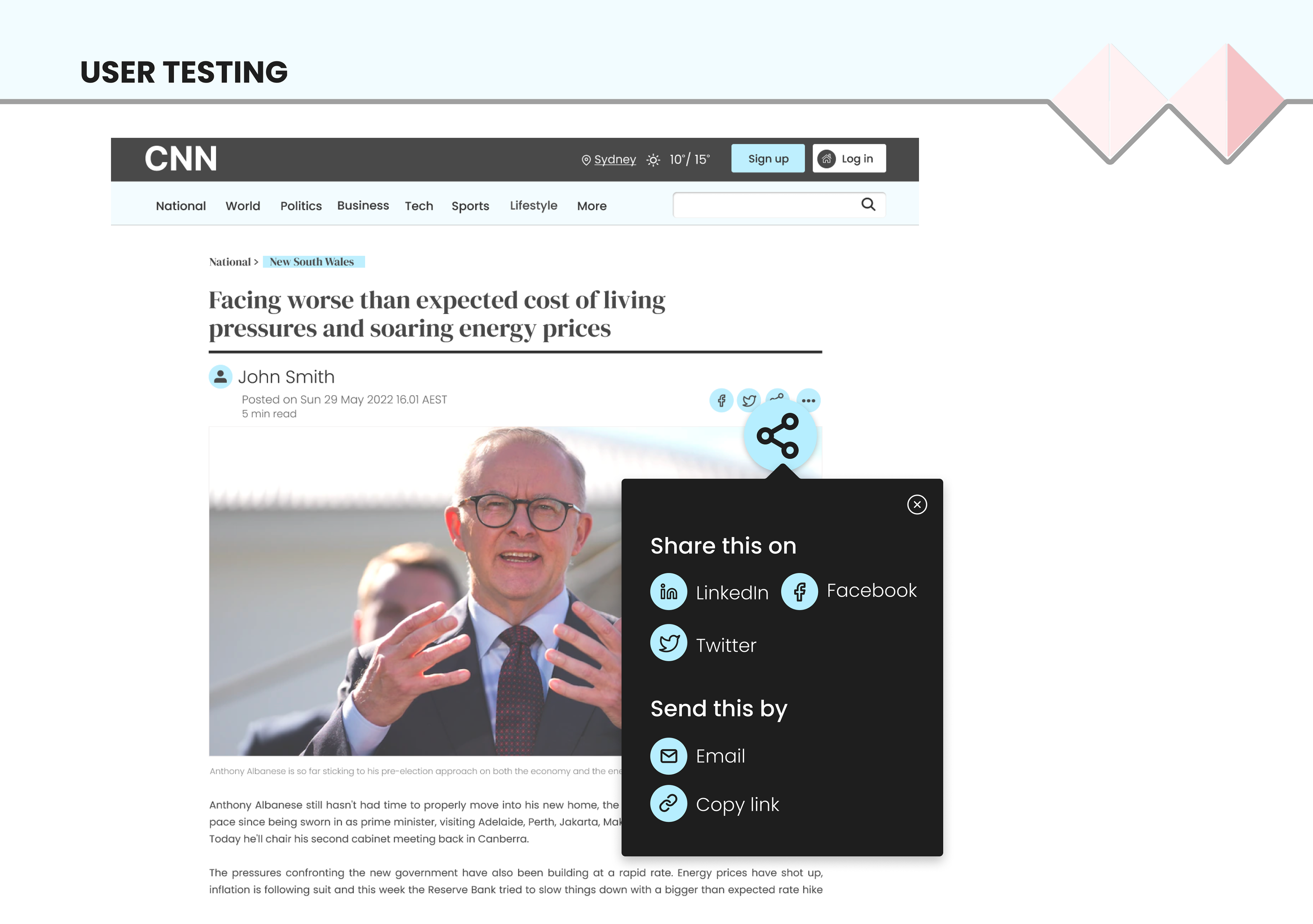
The delivery journey - prototype and user testing
In the prototype I focused on improving the user experience and drive users to sign up.
Some of the insights from the first round of user testing were:
• Users initially did not know about the possibility to customise
• Customisation feature showed to be interesting to users once adjustments were made to the design
• Users navigated through the homepage with ease
• Iconography requires further testing on larger sample > ellipsis x cog

Final considerations
Overall, the new design was well received from users and minor iterations were required.