frankie magazine is a national bi-monthly based in Australia, aimed at women (and men) looking for a magazine that’s as smart, funny, sarcastic, friendly, cute, rude, arty, curious and caring as they are.
As well as the magazine, they have a number of brand extensions and other offerings that are important. These are: seasonal products on the shop (eg. diary and calendar), special volumes of editorial products, a business club “strictly business”, the regular blog with frequent content updates, and more.
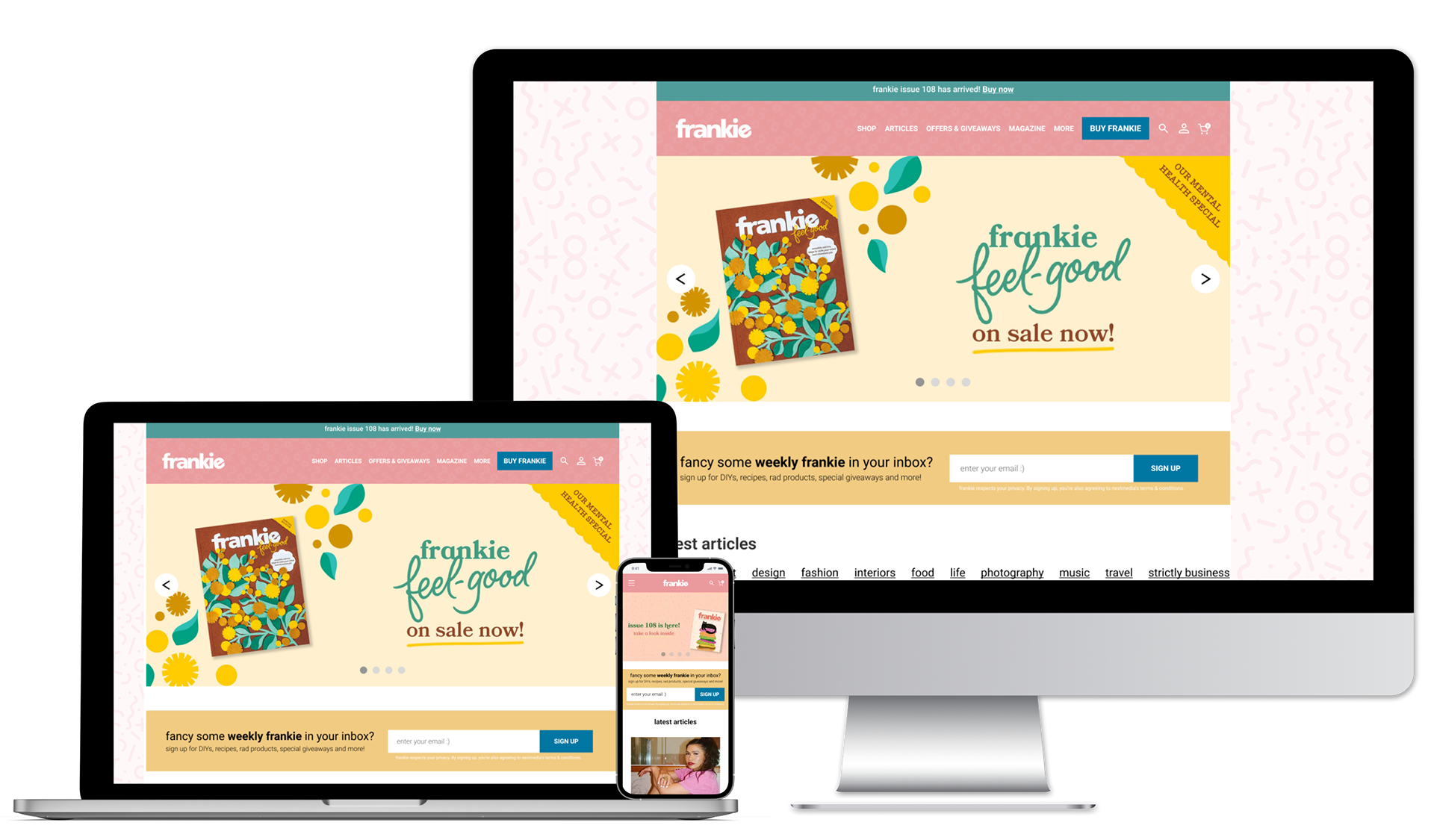
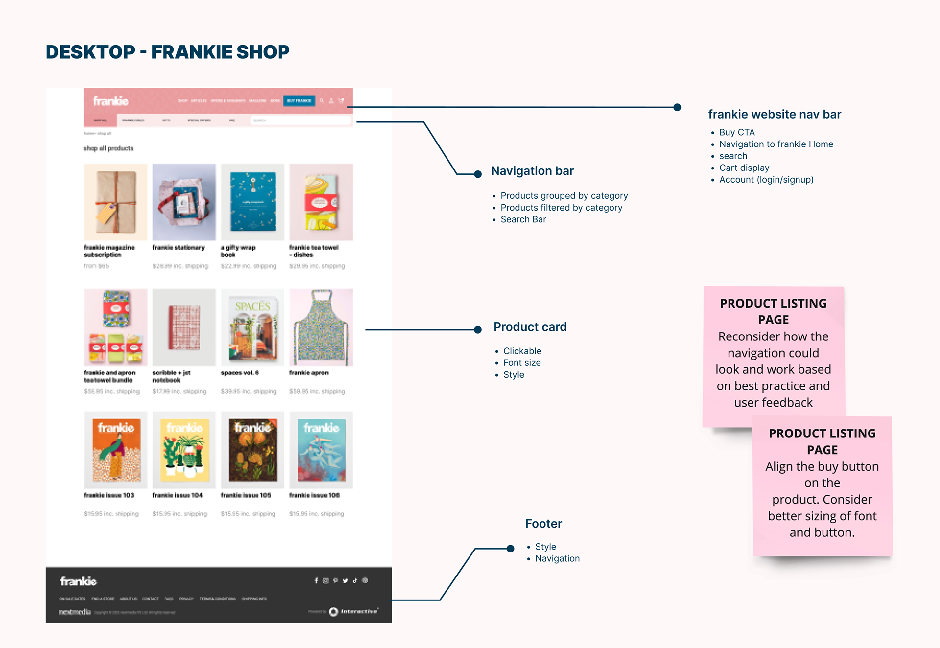
frankie magazine’s website is built on a custom CMS the site is uploaded to twice daily in the form of blogs, and is also connected to a shop which can be found at frankie.com.au/shop. The majority of traffic to the shop comes via the mobile version of the site. frankie's priority as a business is their online shop, and their ‘hero’ product is magazine subscriptions.
Project overview
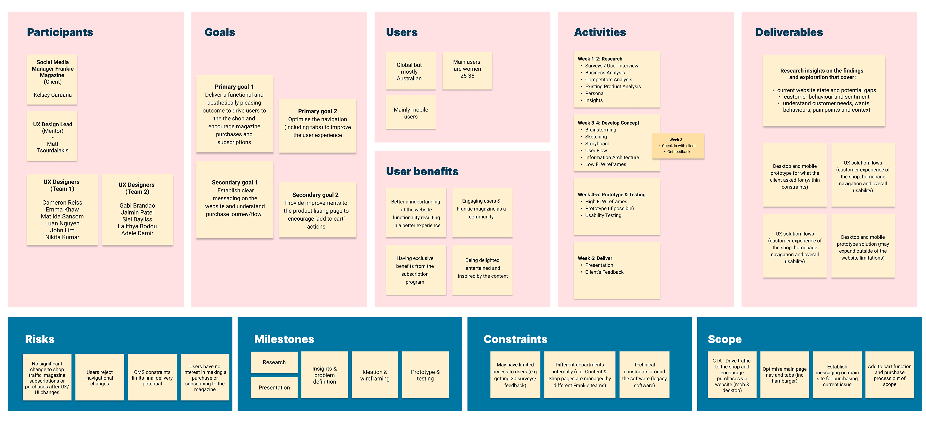
The purpose of the project was to evaluate the website user experience, in regards to shop navigation and purchase journey, as well as general experience on the main home page, specifically focussing on page navigation and menus.
Primary Objectives
1. Explore the most functional and aesthetic opportunity to drive traffic to the shop and encourage purchases (especially for subscriptions)
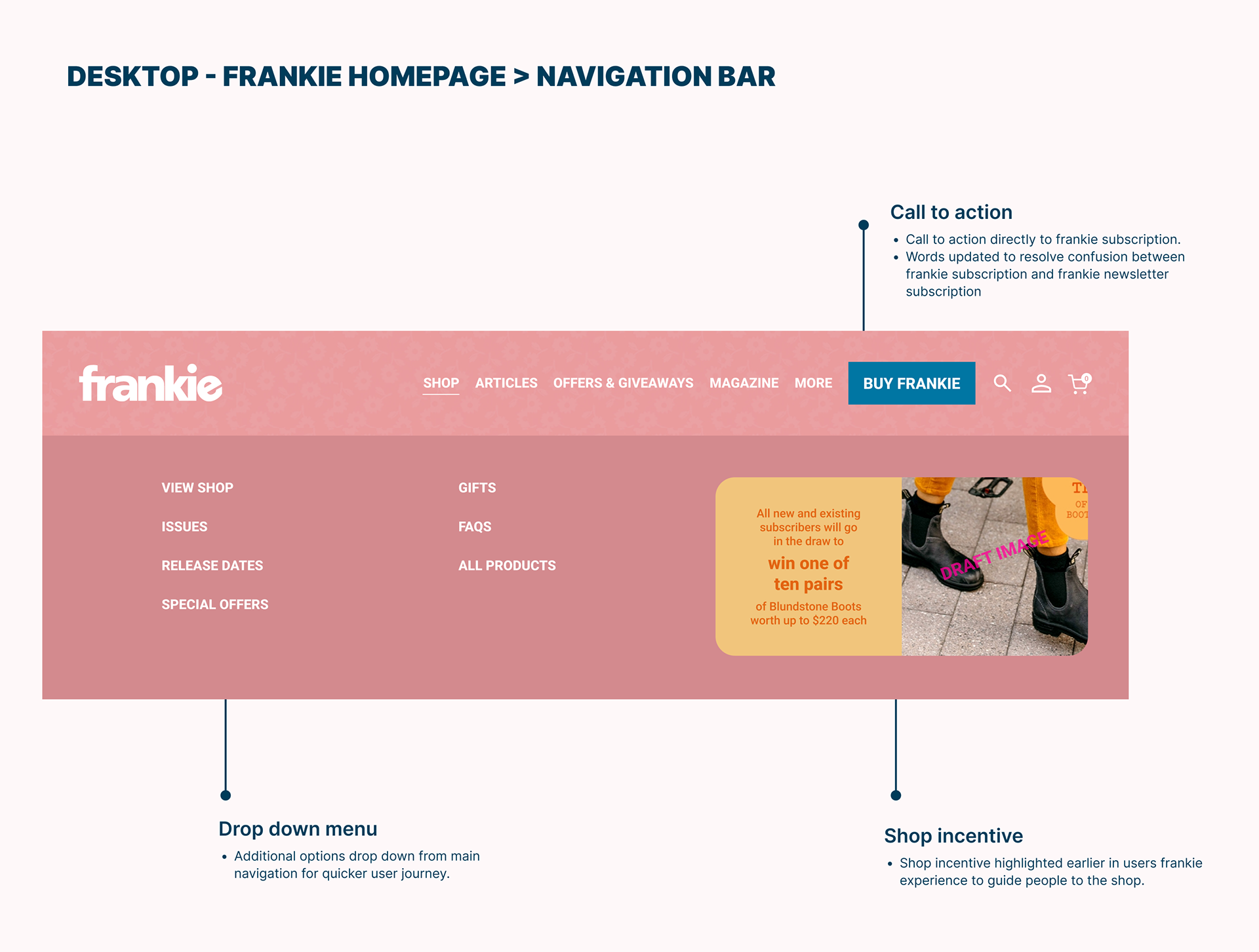
2. Optimise the main page navigation and tabs (including top header tabs and hamburger menu items)
Secondary Objectives
1. Establish clear messaging on the main site about the current issue and how/where to buy it
Key Deliverables
1. Research insights on the explorations
2. UX solution flows (usability + customer experience of shop and home page navigation)
3. Prototype of the solution
Scope
Scope
1. frankie's homepage: overall navigation and menus
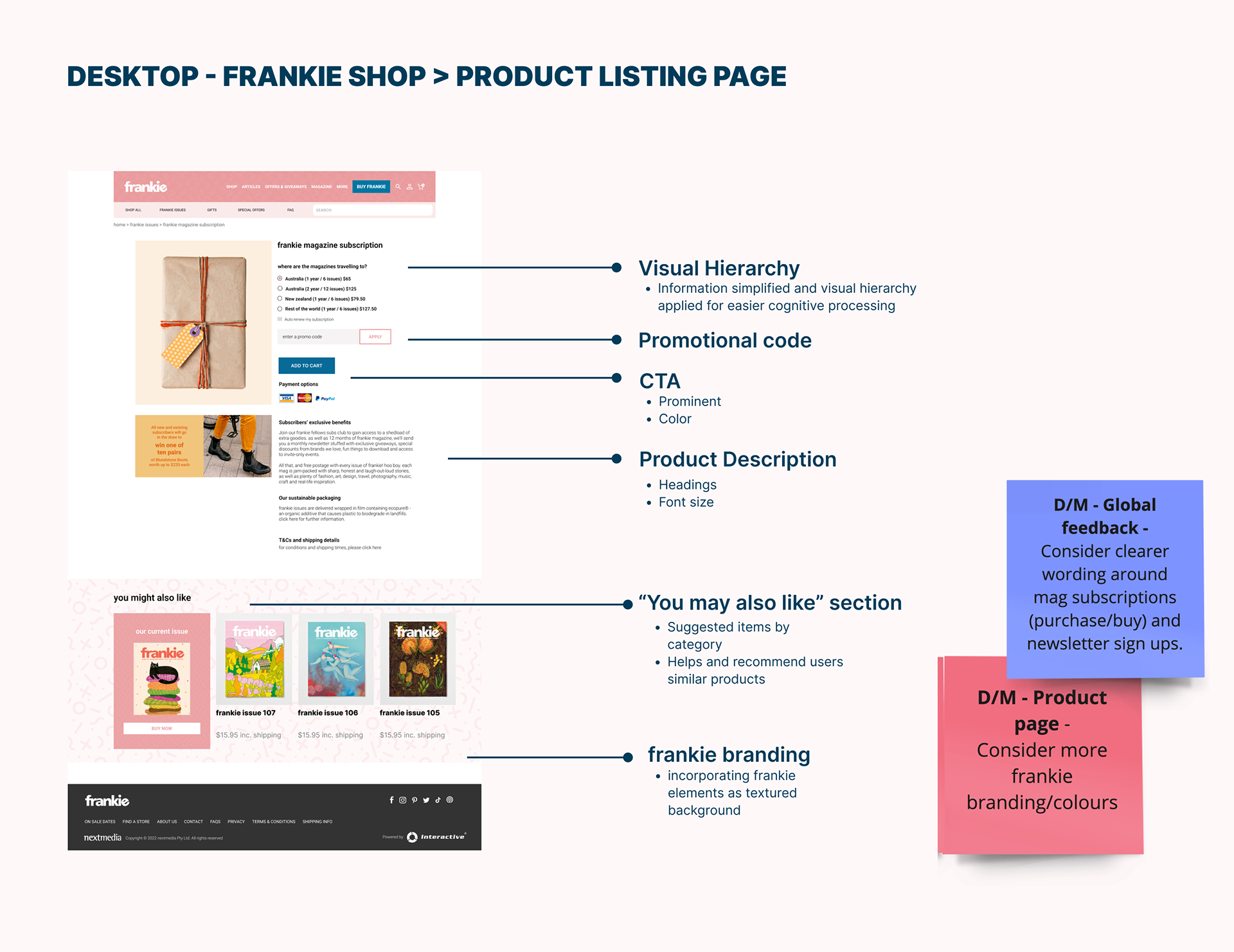
2. frankie's shop: shop homepage and product details page only
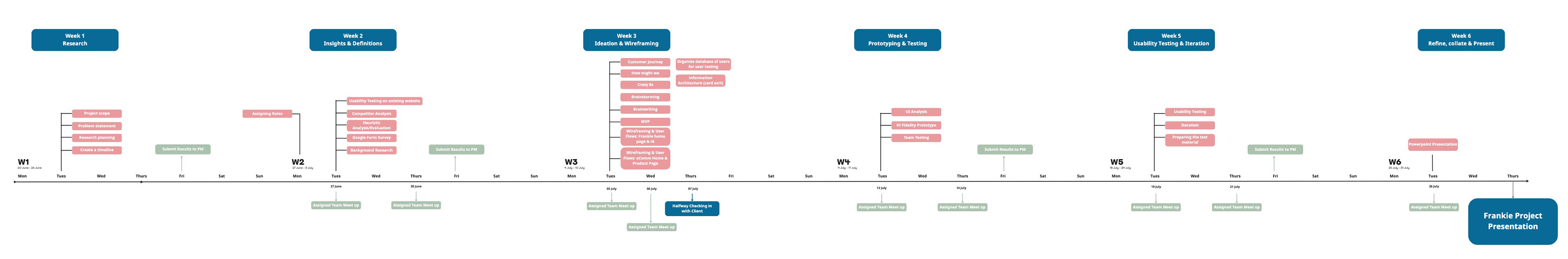
Project timeline
Project Canvas
Research and discovery
The first 2 weeks of the project were dedicated to discovery. Including background research, competitor analysis, heuristic evaluation and usability testing on frankie's homepage and shop.
Phase 1 - Competitor analysis and heuristic evaluation
• Exploratory research: online and frankie's past research insights (e.g. GA, etc)
• Competitor analysis
• Heuristic evaluation
Phase 2 - Surveys & interviews
Quantitative
• Google form survey with broader audience
• Google form survey with frankie's customers
Qualitative
• 1:1 Homepage user testing x 9 (3 users and 6 non users)
The data gathered from the research with both groups helped us identify the main pain points and areas for improvement.
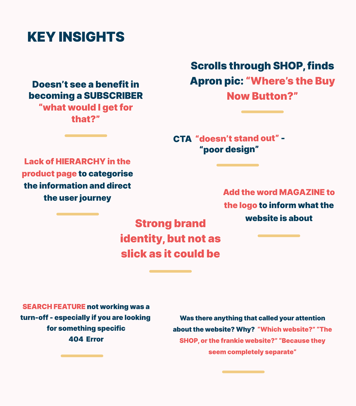
User testing insights
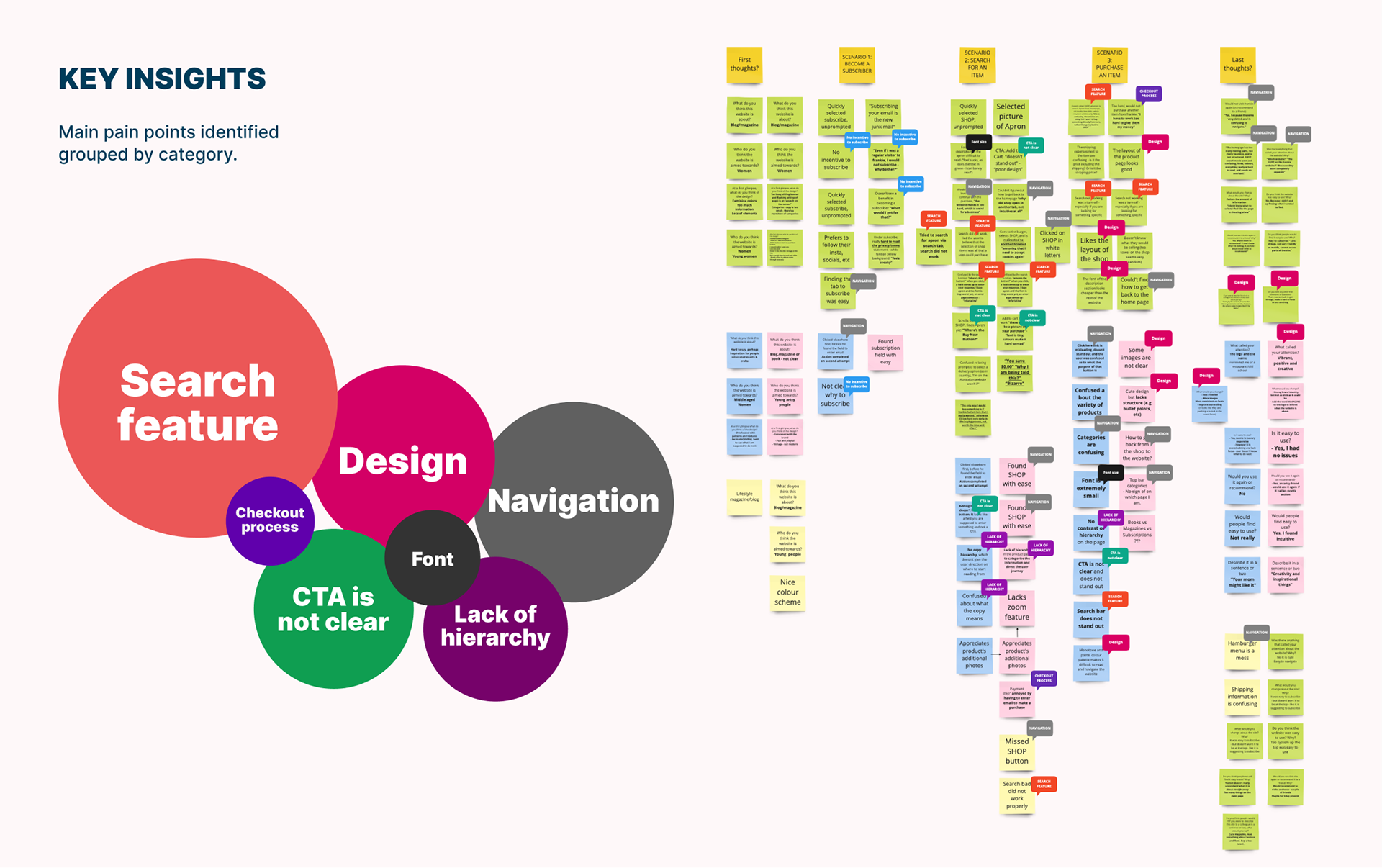
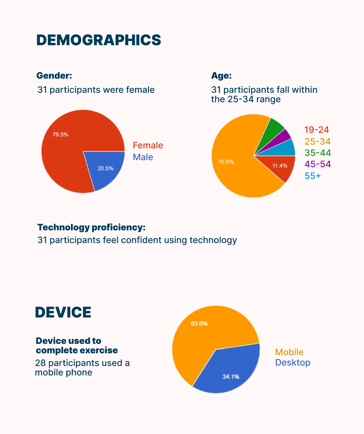
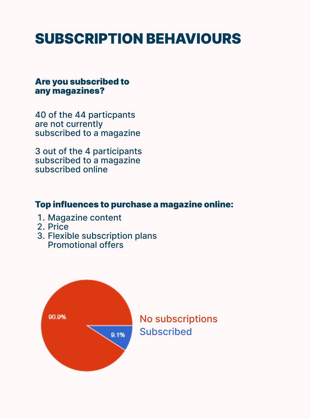
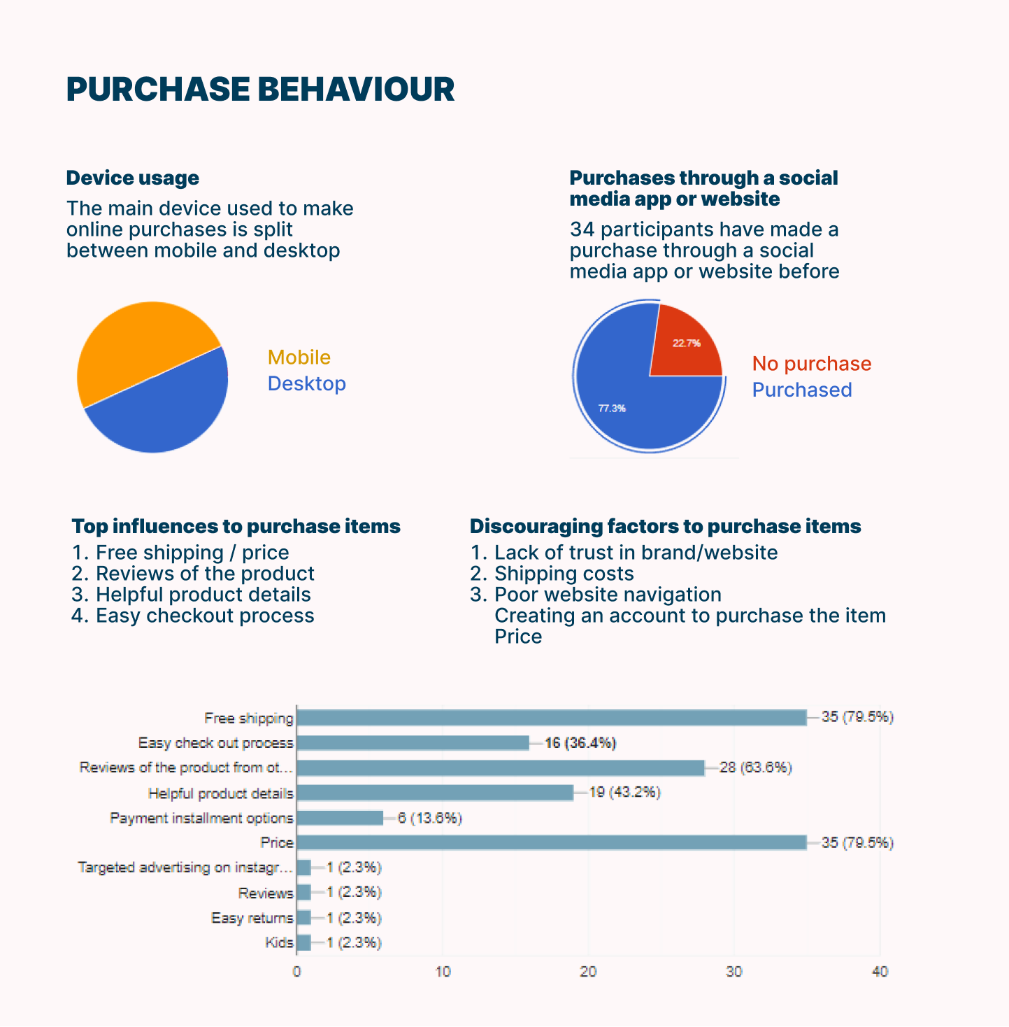
Key findings of our quantitative survey
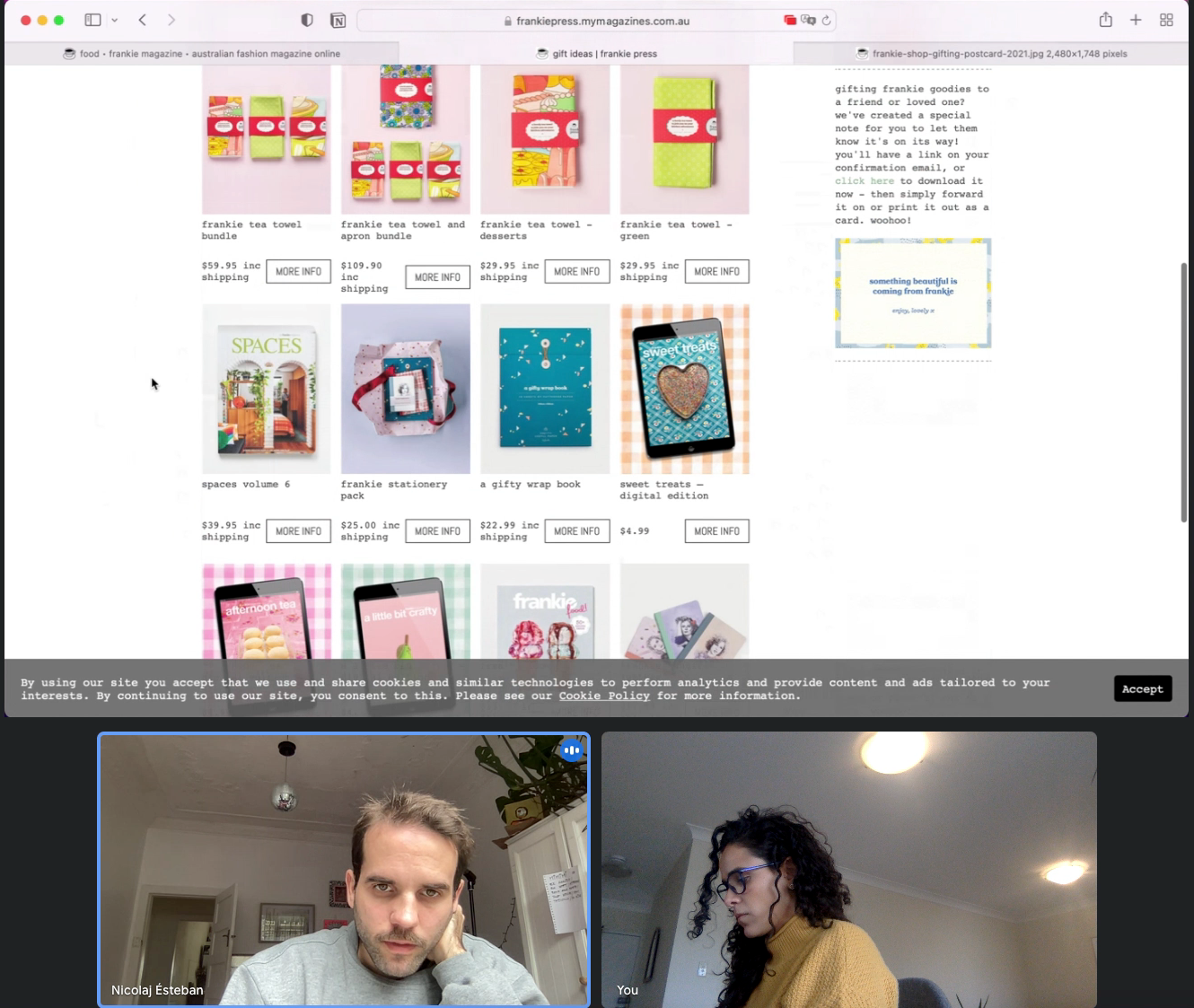

Screenshot of 2 testing sessions on frankie's shop.
The development journey
Empathy and customer journey maps were created to synthesise insights from a human centred perspective and to help us understand the interaction and experience users were having navigating frankie's website and shop across various activities.


Empathy map and customer journey map
Card sorting and main navigation
After the research rounds a card sorting exercise was conducted with 10 users to understand how people use the navigation menu and to help us define how the top navigation bar would look like.
From the first round of user testing and the insights collected in the card sorting exercise an opportunity rose to design a more comprehensive navigation plan by grouping categories appropriately. Basic linear user flow scenarios were also drafted to guide us through the process.
From the first round of user testing and the insights collected in the card sorting exercise an opportunity rose to design a more comprehensive navigation plan by grouping categories appropriately. Basic linear user flow scenarios were also drafted to guide us through the process.
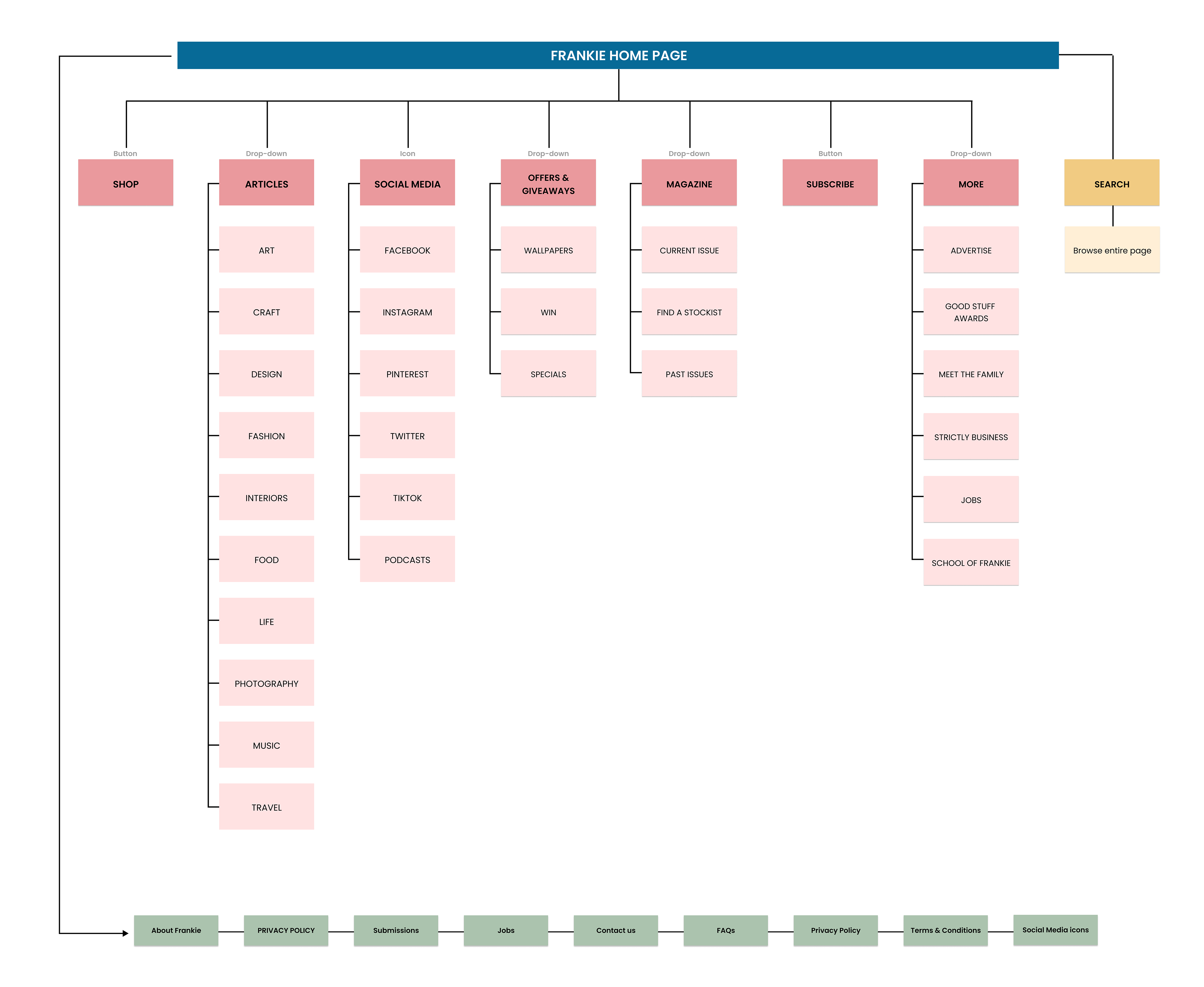
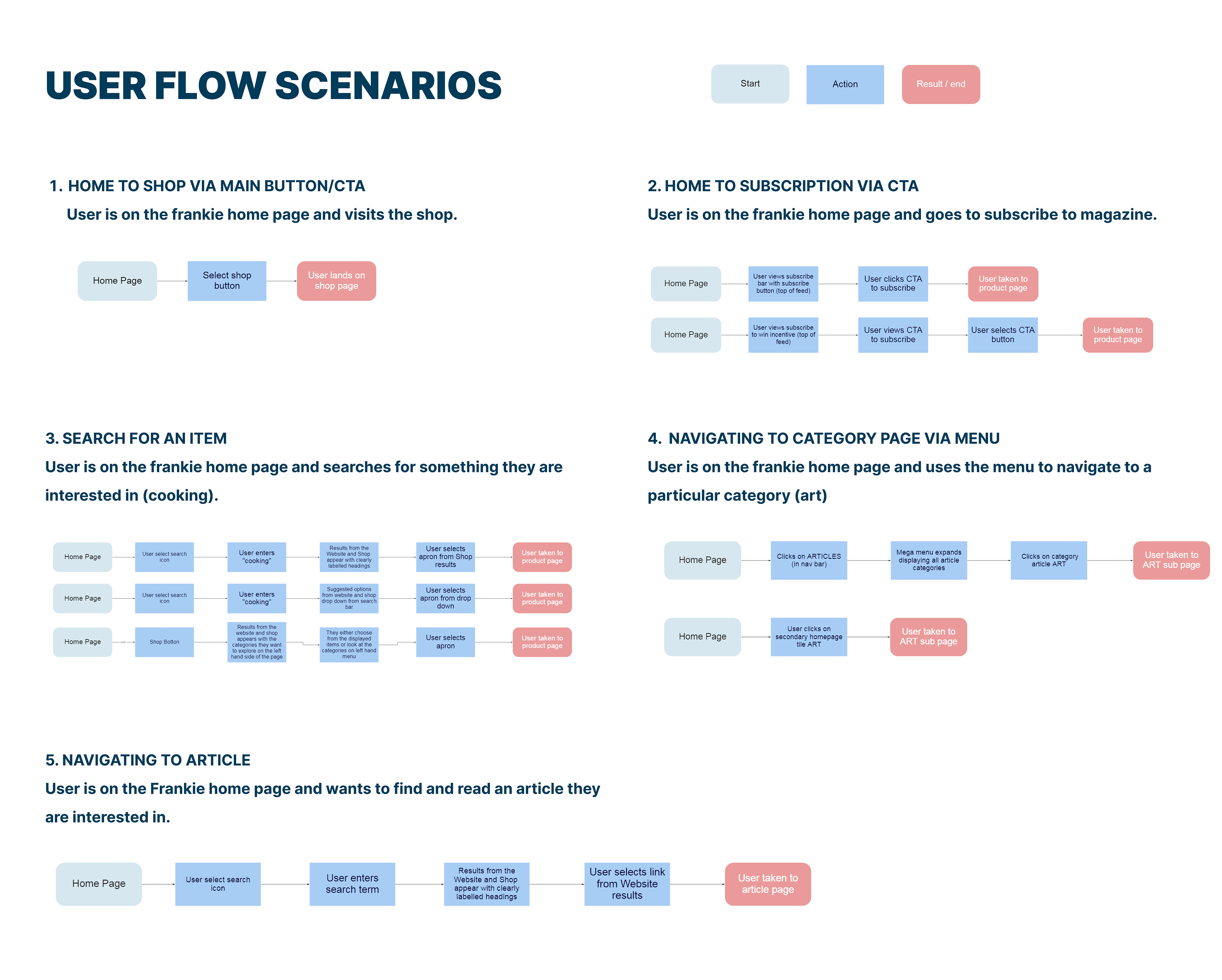
frankie website Information Architecture and user flow scenarios
Ideation
A series of 'how might we' questions were developed to reframe the problems into opportunities for ideation. After the ideation session and voting exercise an MVP matrix was used to help us prioritise the best solutions.
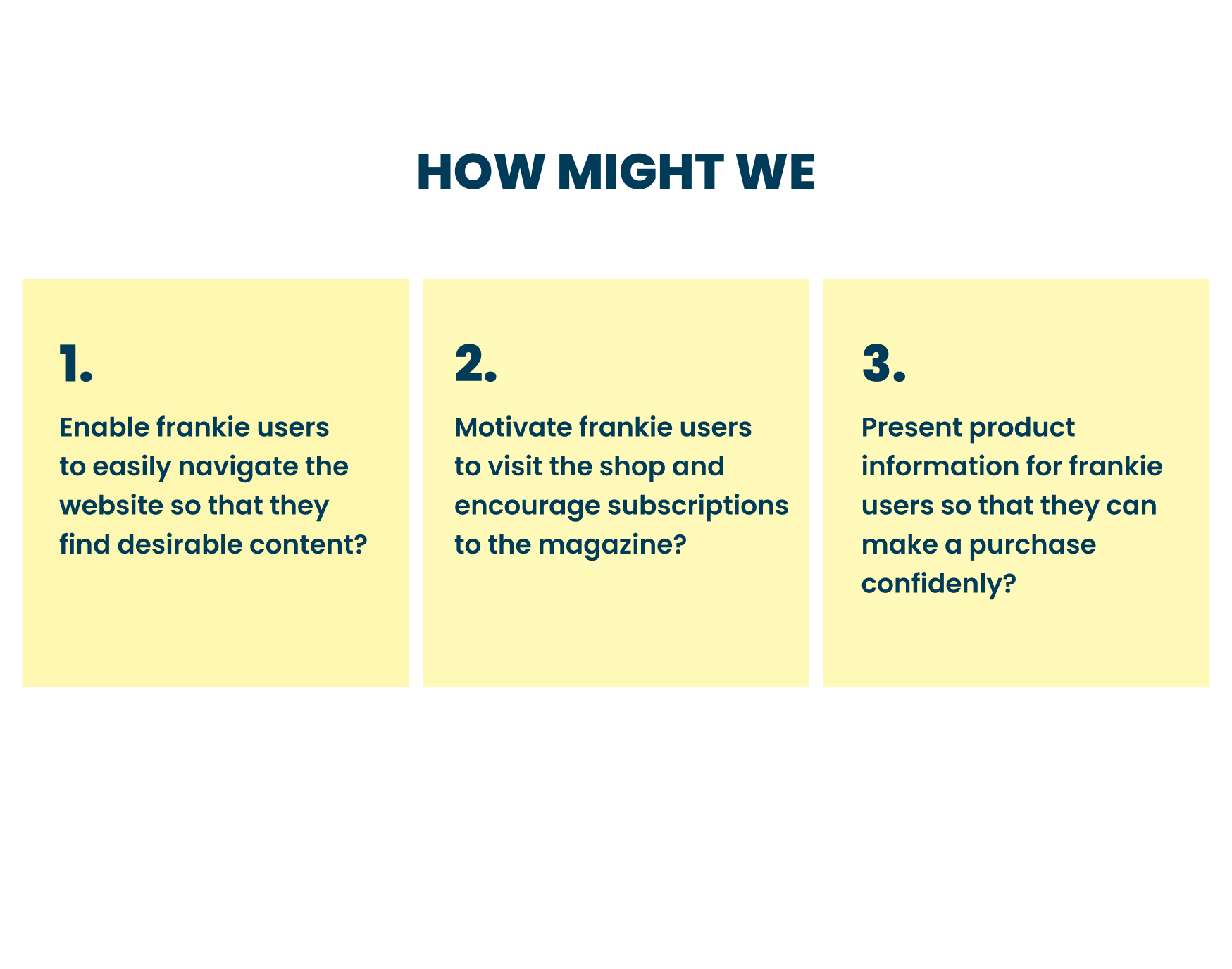
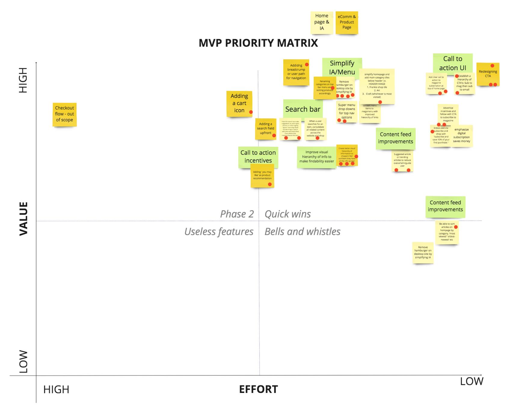
How might we's and MVP matrix
Wireframes and prototype
After the ideation session, wireframes were designed to illustrate the solutions identified in the MVP matrix. As a team, we tested them out and moved towards designing a high fidelity prototype to test among users.
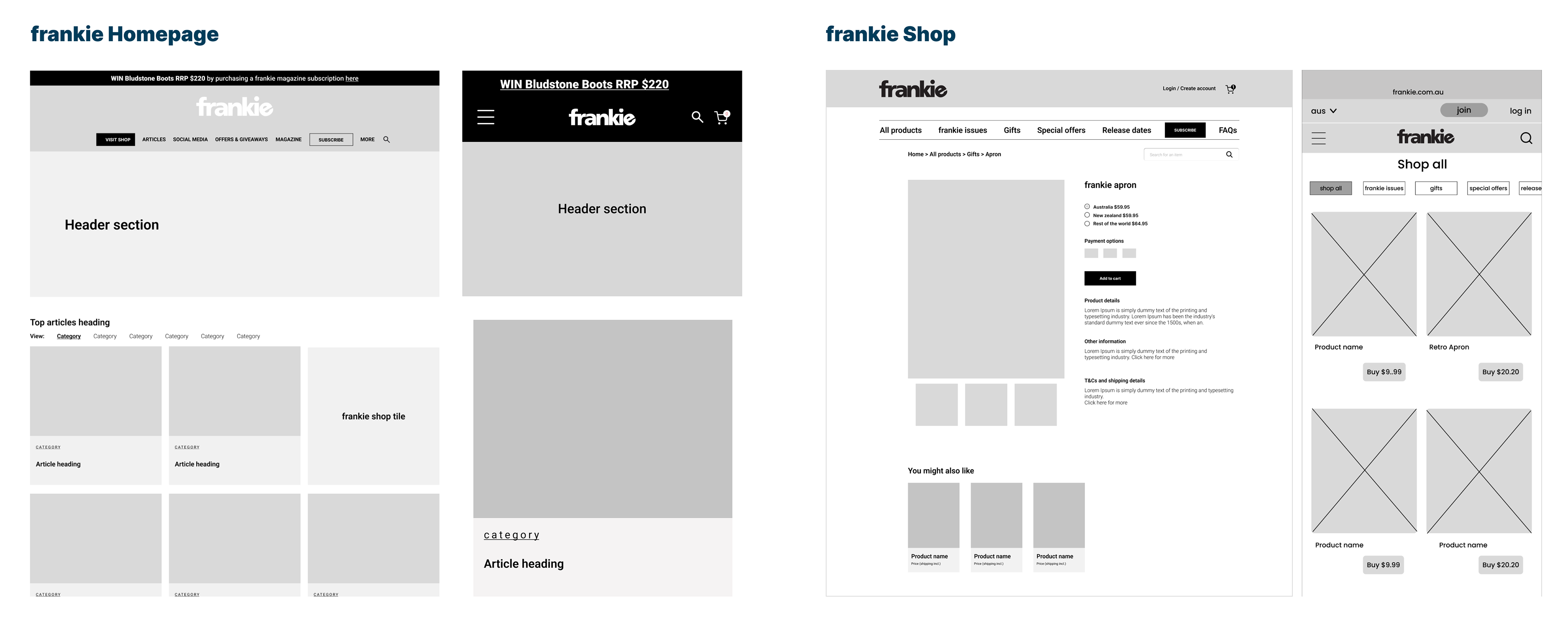
Wireframes
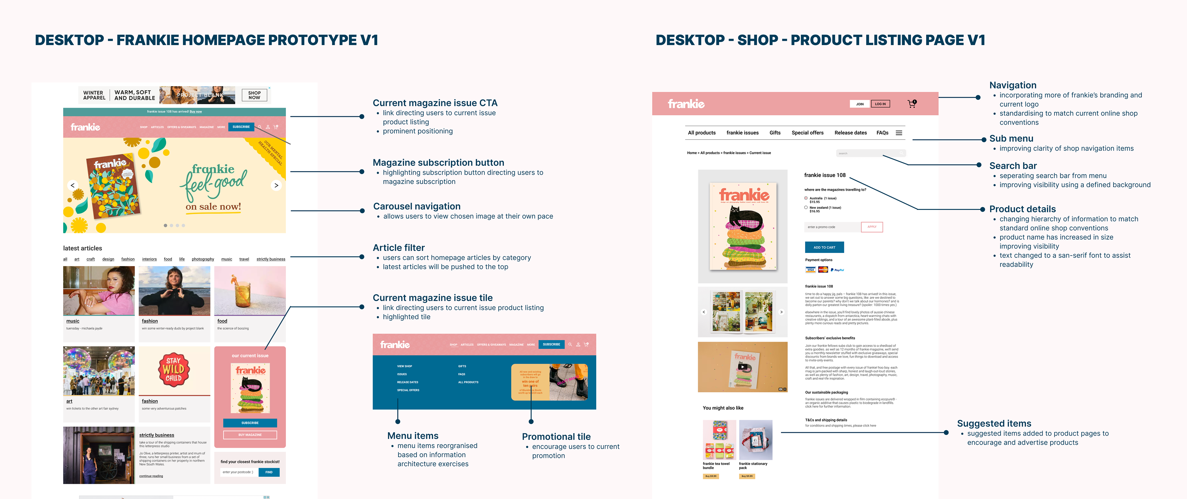
The delivery journey
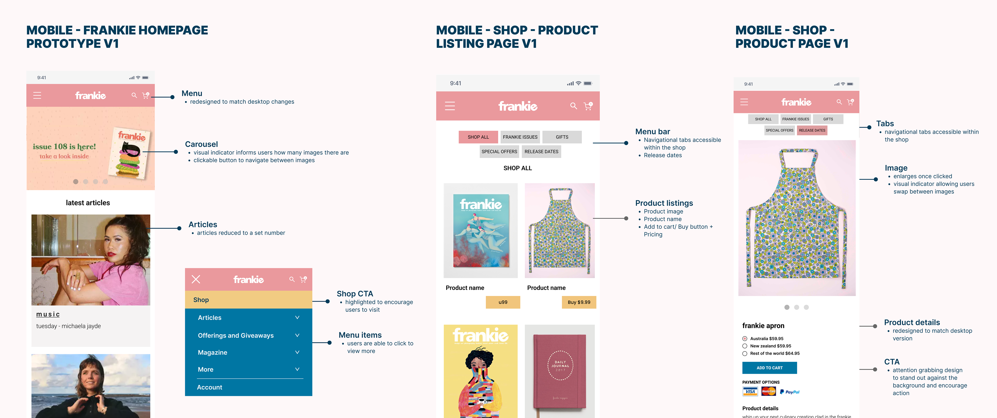
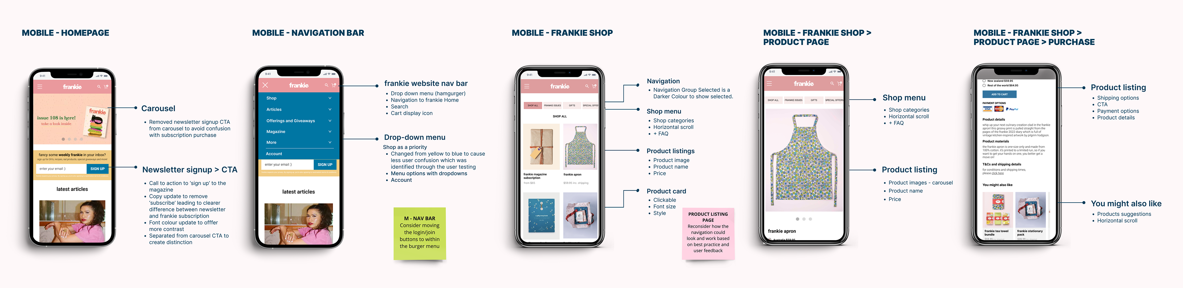
In the prototype we focused on improving the user experience on the homepage, specially on the shop. Some of the key pain points we addressed were:
Second round of user testing and iterations
On the the second round of user testing our goals were:
• To understand how well participants can interpret and use the frankie website prototype.
• To test whether our designs have solved the problems that were identified during the first user testing session.
• To gather feedback on the prototype and implement further changes as needed.
The insights collected on the second round of testing identified room for improvement and iterations had to be made to improve the design. Some of the key pain points addressed are marked below:

Recommendation and next steps
The key takeaways and recommendations we had at the end of the project were: